Early on in the IRMA made easy project, we conducted an expert evaluation of the IRMA app. You can find a blog post detailing our findings here. One of our main goals for our project was to eliminate the usability problems found in the old version of IRMA.
While we originally had planned to improve the IRMA app step by step, things turned out even better: Around the start of our project, we learned that the municipality of Amsterdam (and specifically Mike Alders) was designing an ideal identity management app. And just like the IRMA team, they did this in an open-source fashion. Their design for an identity management app was based on a wallet metaphor that was easy and intuitive. We quickly realized that their concept fitted IRMA perfectly and solved many usability issues. Fortunately, we were able to adapt our project and join forces. As a result, the IRMA made easy project has focused on implementing an entirely new design and making that new version of the IRMA app even better by addressing prevailing accessibility, usability and security issues.
The new IRMA app was released on June 3rd (2020) for iOS and on June 4th on Android and can be found on the App Store and the Google Play Store. With the new IRMA app in the hands of thousands of users for almost one year, we decided it is about time to revisit the identified usability problems of the old app and discuss whether they indeed have been solved. In this blog post, we summarize our main findings, one issue at a time.
Understanding IRMA: A wallet to the rescue!
One of the biggest problems of the old app was that it did not communicate what IRMA is and what it can do. Revealing personal properties - such as one’s age - rather than using, e.g., passwords and usernames to access online content is a new concept for users. Such a novel approach needs to be communicated through careful interaction design, visual design and language. As remarked in our expert evaluation of the old app, the old IRMA app used quite a technical language, e.g., talking about “disclosing attributes”. Also, the old IRMA app visualized these so-called attributes (e.g., a user’s name and age) abstractly. This made it difficult for users to understand what IRMA is about and what they can do with the app.
The new app overcomes this issue with a metaphor: IRMA now looks like a wallet. Just like a real wallet, users can fill the IRMA wallet with cards containing personal information. This idea is known to people from the physical world and helps users form a mental model. What is more, users might also know the concept from other wallet apps that, e.g., allow them to collect flight tickets.1
We expect that with this new metaphor, IRMA in general will be much easier to understand. Have a look and judge for yourself:
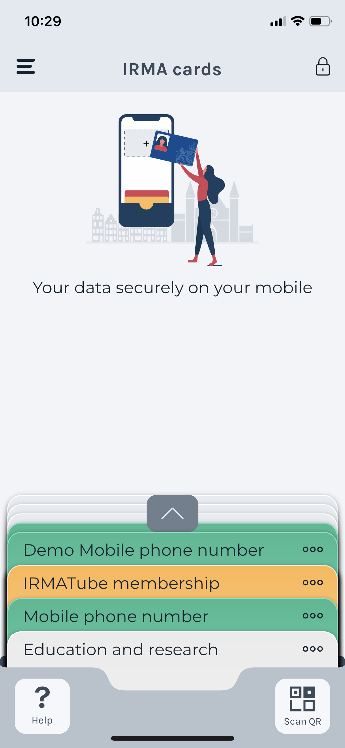
Something else that strikes the eye immediately is the new IRMA app’s new modern look and feel. While this is subjective, we expect this look to be more appealing for most users.
The wallet concept and the new look and feel improve IRMA in general. The changes result in a better overall user experience. We will revisit more specific usability issues that relate to completing certain tasks in the following.
Onboarding
In the old IRMA app, we encountered a few issues during the onboarding. First of all, we noticed that the explanatory screens that inform new users about IRMA were likely to be skipped or overlooked. Furthermore, we noticed colour contrast issues and visual design issues (the screens looked quite crowded). Other issues we identified during the onboarding in the old IRMA app concern the used texts. In particular, we were worried about using the words “attribute” and “account”. Furthermore, we noticed that users encounter a large amount of text during their first steps.
The new IRMA app has addressed all of these issues with entirely new onboarding screens that guide users through the information, and that cannot be skipped. You can see a screenshot of the new onboarding screens below.
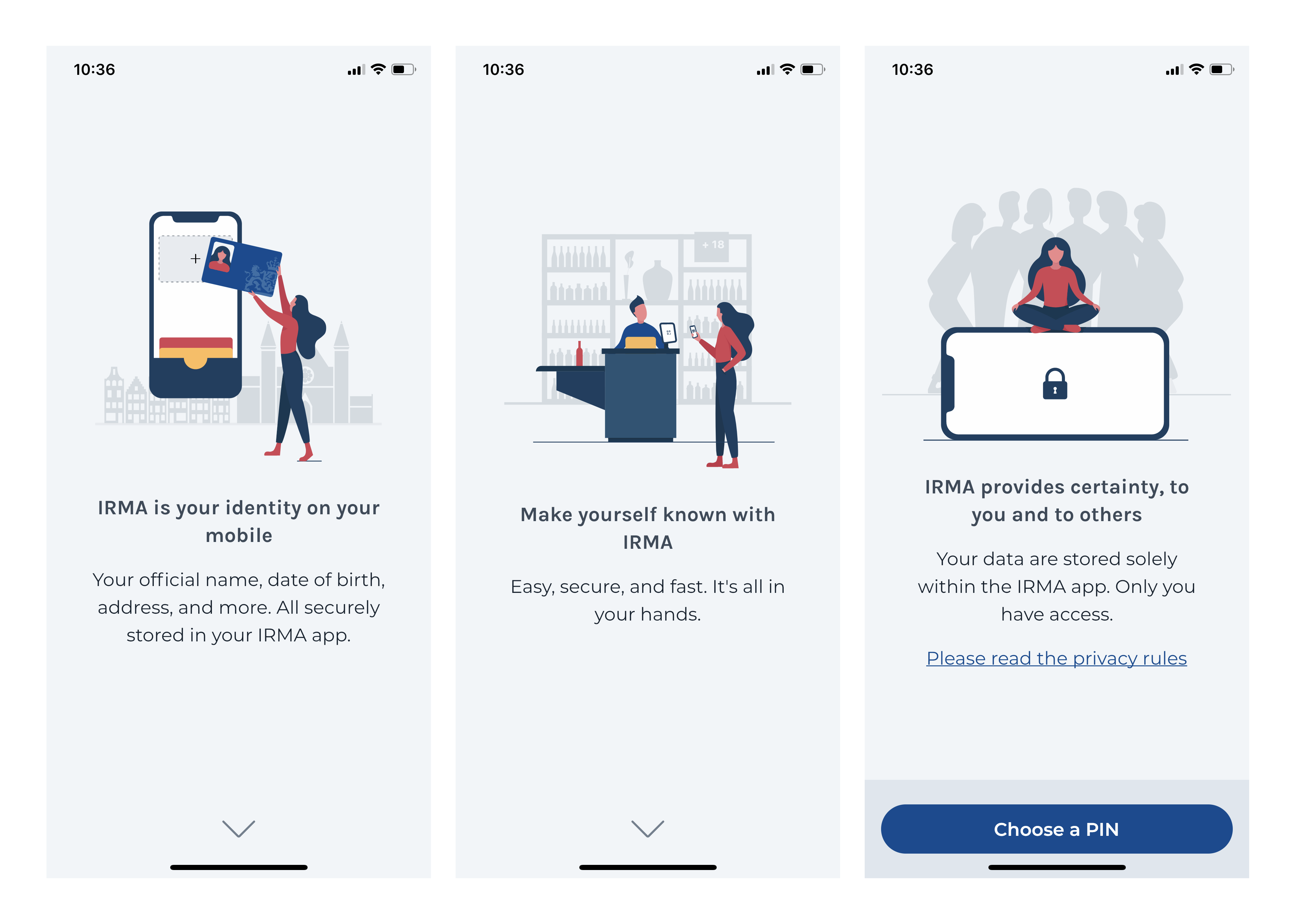
Of course, users can still proceed without actually reading the onboarding information. But at least, users are no longer nudged to skip the information. Also, there are no visual design and colour-contrast issues that prevent users from reading the text if they wish to do so. In fact, as part of the IRMA made easy project, we have evaluated colour contrasts and made sure texts are readable, also with the help of Stichting Accessibility (see our blog post on colour contrasts).
The texts in the new IRMA app are not only readable but also short and concise. Also, the words attribute and account are no longer used. The language also picks up the metaphor of the wallet and, e.g., talks about “adding cards”. As a consequence, the app now uses everyday language users know and intuitively understand.
Choosing a PIN: 12345 is still insecure!
The old app asked users to choose a PIN of at least 5 digits. We noted that this could be confusing. The new IRMA app solves this issue by asking users for a default PIN of 5 digits but allowing users to chose longer PINs via the app settings. For entering the 5 digits, the new app also uses one of the famous design principles of Don Norman, namely constraints. The screen displays a box for each digit, and it is not possible to fill in more than the required 5 digits.
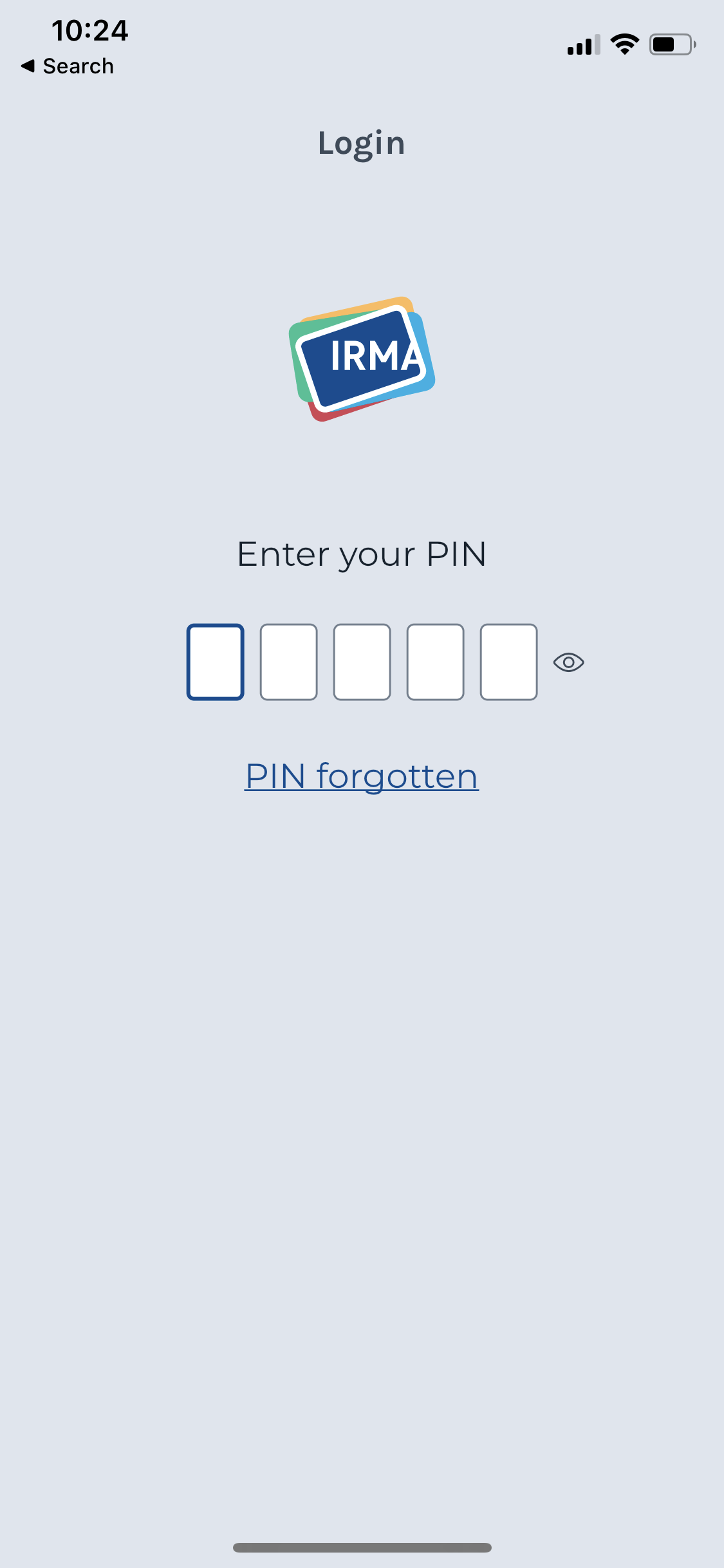
Another issue we noticed in the old app is that insecure PINs (like 11111) are allowed. The same concern was voiced by Radically Open Security in their security assessment of IRMA. Unfortunately, this issue has not been solved in IRMA itself yet. However, the IRMA made easy project has done extensive research into solving this issue, prototyped a solution, and presented a recommendation to the IRMA developers. You can find blog post dedicated to this issue and a proposed solution here. We are thus confident that this issue is addressed by IRMA in the future.
Improved flow
Smaller issues in the onboarding, such as unclear paths to proceed, conflicting calls to action and misleading use of colours, were all solved with the new visual design and onboarding flow. The new flow generally presents the user with one action per screen (e.g., an email address is set on one screen and confirmed on the next screen).
The new home screen
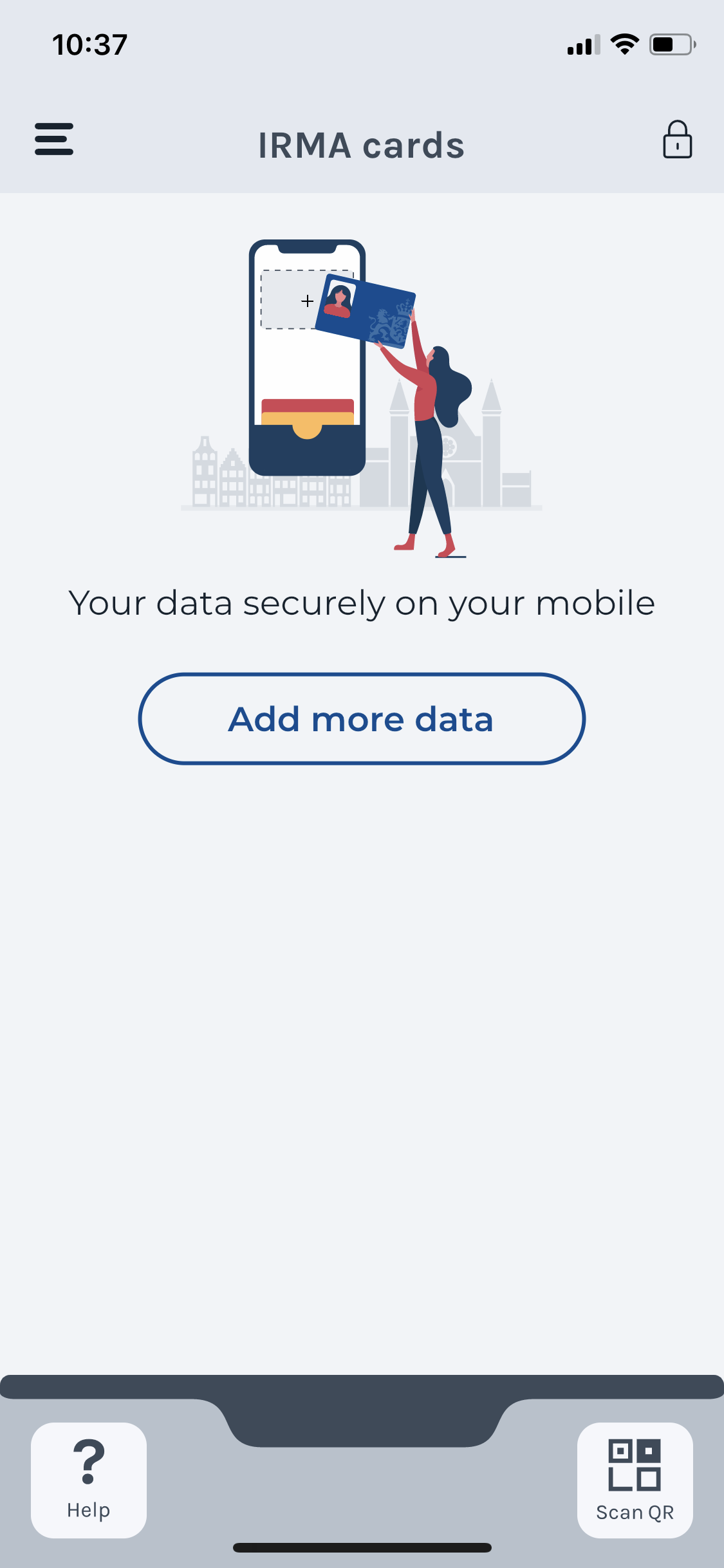
In the old IRMA app, the onboarding was completed in a rather confusing way. Users were confronted with an empty app and a big blue button that would open the camera to scan QR codes. However, at this point, users often have no idea what QR code to scan.
When users complete the onboarding, they ideally continue with loading personal information into the app. The new app helps users with this by providing a clear nudge to do so. The nudge guides the users to an in-app overview of useful data they can load. This brings us to the next big improvement: users can easily add cards with personal information to their IRMA app.
From obtaining attributes to adding cards!
In the old IRMA app, users had to visit the website of the Privacy by Design Foundation (see screenshot below) to see what data they could add to IRMA.
We thus suggested to list the available credentials in the app itself, so people do not navigate out of IRMA at this point. The Amsterdam UX team and the Privacy by Design Foundation had a similar idea. Together, we developed an in-app-overview of the most relevant and generally useful pieces of information:
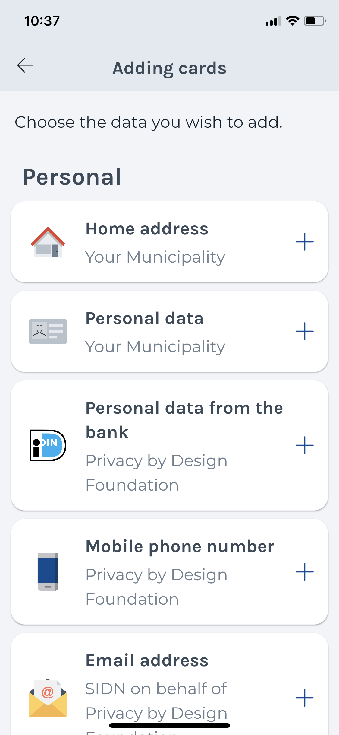
Listing these available data in IRMA is also useful because switching between IRMA and a browser can be quite confusing. With the list being part of the app, switching is reduced.
Notably, the current/new IRMA app list does not list all available attributes. This means that the list is rather small and still and clear. However, if IRMA gains much more traction, this list might benefit from a filter or search function that allows users to find the data they are looking for quickly.
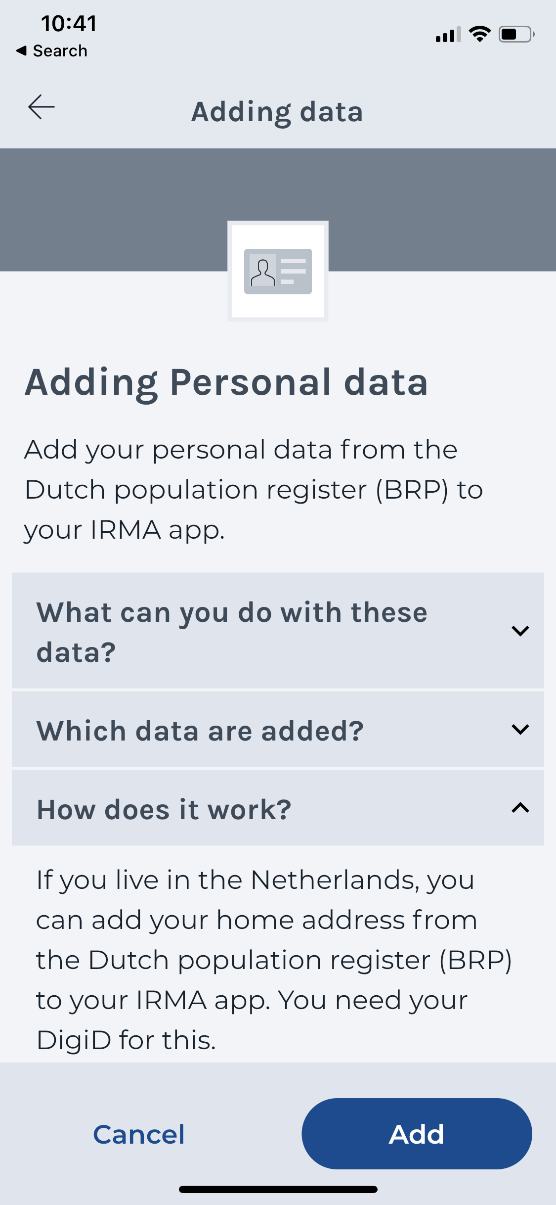
In the old app, we also noticed that the requirements to load certain data into IRMA were not always clear upfront. Consequently, users would find out that certain data is not available to them only during the process and thus “hit a wall“. For instance, one needs to live in the Netherlands to obtain personal data from the municipality of Nijmegen. (Everyone in the Netherlands can load it). To ensure users know upfront what is needed to load data into IRMA, the relevant information is now presented upfront. Users can now find out that they, e.g., need their DigiD (an identity management platform that government agencies of the Netherlands can use) ahead of time to load personal data from the municipality of Nijmegen.
Loading data has become much more intuitive with the card metaphor. However, the general idea that one loads data into IRMA by obtaining it from an issuer is still confusing, especially when one needs to use another authentication service to authenticate at that issuer. This brings us to the next sub-issue: the issuance flow.
Issuance flow
In the old app, we noticed that loading data into IRMA would force users to potentially navigate through many different websites in the old app. Users who tried to add data from within IRMA were first sent to the website of the Privacy by Design Foundation website. From there, they would move on to the website of an issuer, who might even send them on further. The issuance website of the municipality of Nijmegen, for instance, sends users to the DigiD website, which then prompts users to open the DigiD app. From DigiD, users would then return to the municipality before finally arriving in IRMA again.
Unfortunately, this frequent switching between IRMA, websites and other apps could only be improved partially so far. As mentioned, it was possible to get rid of the need to visit the Privacy by Design Foundation website to get an overview of available credentials. Also, the process has been improved by preparing users better for this process by briefly describing what they can expect in advance (see above). Yet, it is clear that obtaining attributes is still a relatively complex journey that involves many different parties.
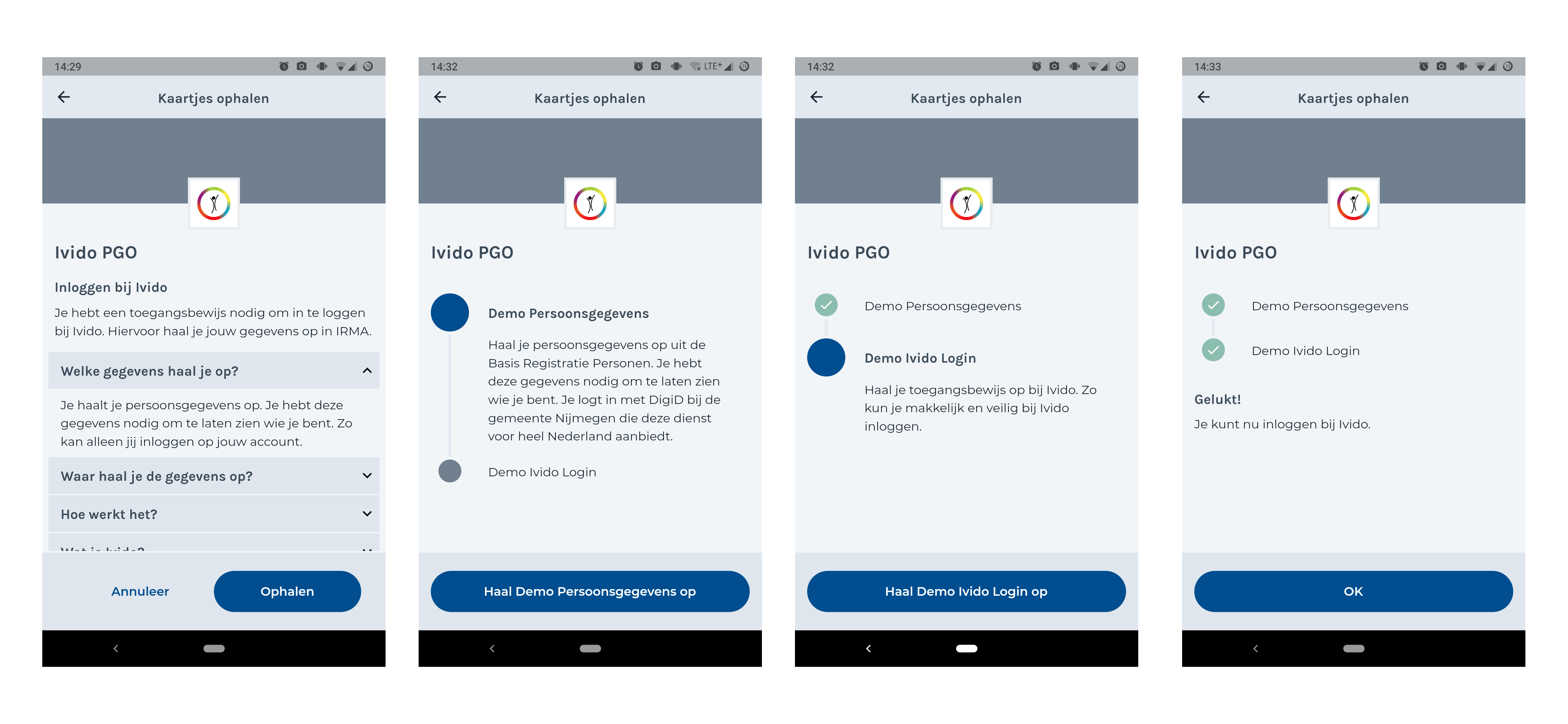
In the future, we suggest making the general journey that underlies every issuance session more clear. For more complex journeys, where several cards need to be obtained, and possibly even in a specific order, we envision the IRMA app to guide the user through this process. With Ivido, SIDN and the Privacy by Design Foundation, the IRMA made easy project has already prototyped a so-called IRMA-wizard (see screenshot). This feature will guide users through this process — one card at a time. While still in development, we expect this feature to improve more complex issuance-flows in the future.
Disclosing information
Users can use IRMA for many different purposes where the disclosure of (personal) information plays a role: e.g., to log in at a website or sign a document. When evaluating the old IRMA app, we identified several issues regarding the disclosure of information.
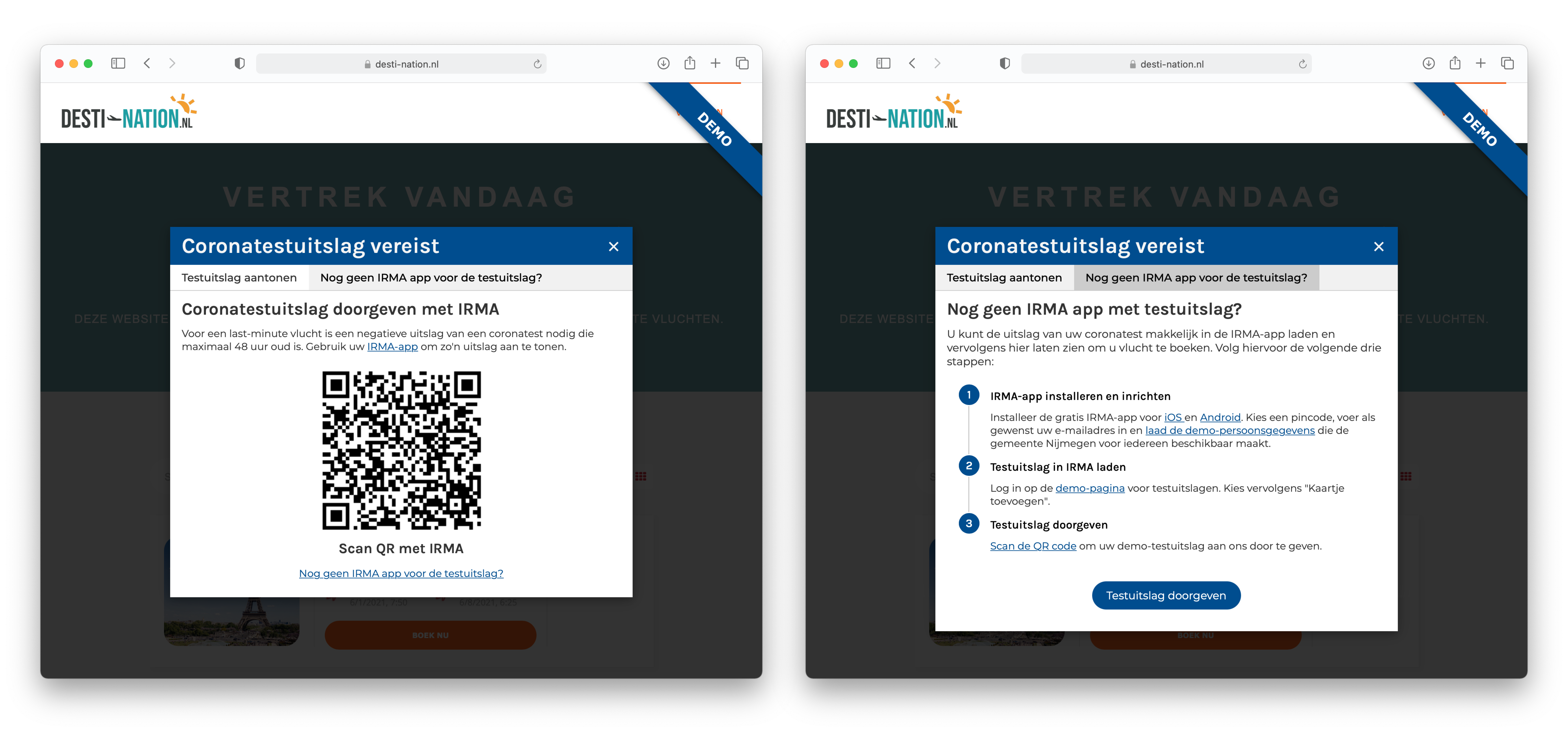
First, we noticed that problems can arise when a user aims to log in to a website that requires IRMA but does not have IRMA installed yet. For users on a mobile phone, this can be detected automatically, and in the meantime, the situation has improved: Users are now automatically lead to a page from where they can obtain IRMA for android and iOS.
For users on a desktop machine, knowing if they have IRMA installed is difficult. It is the responsibility of the website to inform users about how to obtain IRMA. However, the IRMA team can also contribute here: The pop-up with the QR code could include information about where to get IRMA and a link to the irma-website. This idea has also been incorporated in the IRMA demo at https://desti-nation.nl. We suggest including this idea in future versions of the IRMA front-end packages.
When assessing the old IRMA app, we noticed a second potential problem for situations where people use a desktop or laptop computer (rather than their phone) to access a website with IRMA. Namely, people might scan the QR code displayed by the website with their phone’s camera app or another QR-code scanner app. This issue remains, and users still need to scan the QR code with the IRMA app. The good news is that solving this issue is currently on the IRMA UX roadmap. In the future, the IRMA app will open automatically when users scan an IRMA-QR with their normal camera.
A third problem that we identified is that switching between IRMA on the one hand and the website that requests the information, on the other hand, can be difficult — especially for those users who visit the website on a PC and thus have to switch attention back and forth between their phone and their computer. Unfortunately, this remains a challenge inherent to IRMA. The IRMA team could further improve this by guiding users attention with small animations. It also helps that users know similar switches from, e.g., online banking.
What you see is what you share
After scanning the QR, users reach a disclosure request screen (see screenshot). A point for improvement that we identified is the somewhat weird display of the requestor’s identity in the form of a URL.
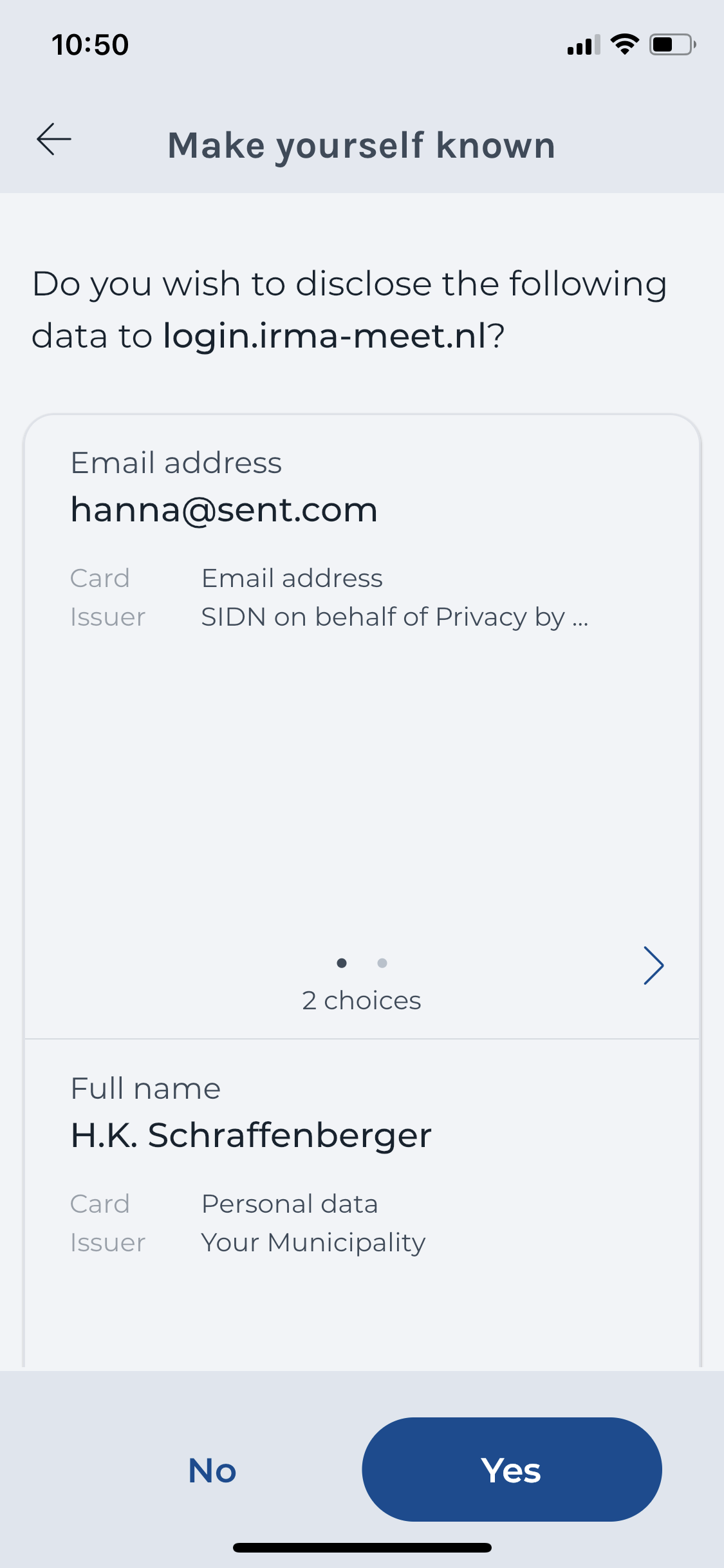
The IRMA made easy project has addressed this issue on the UX side by creating mockups and design concepts for a solution. In the meantime, the developer team from SIDN has now implemented this solution. Internally, the resulting concept is called pretty verifier names. Instead of URLs, IRMA now displays the verified name of the requesting party, together with an optional logo. For instance, rather than seeing the URL “login.irma-meet.nl” the user can see the word “IRMA-meet” (see screenshot). A blue badge indicates that the name has been verified and can be trusted. The result is much more readable for humans.
Because verifying who is the party behind a certain URL is currently done manually and for each requesting party individually (with a check at the Kamer van Koophandel/KvK), this is a feature that is introduced gradually. It also comes with some costs. Interested parties, who want a human-readable name and optionally a logo displayed instead of the URL, can contact Bob Kronenburg at SIDN (see contact-data at the bottom of the site).
Choosing which data to disclose during a disclosure session
When being asked to disclose data, users sometimes are offered a choice among various sets of data. For instance, the address-verification demo-website from the Privacy by Design Foundation asks users to provide their address either from the Dutch population register or from iDIN. Similarly, users often can choose among different email addresses.
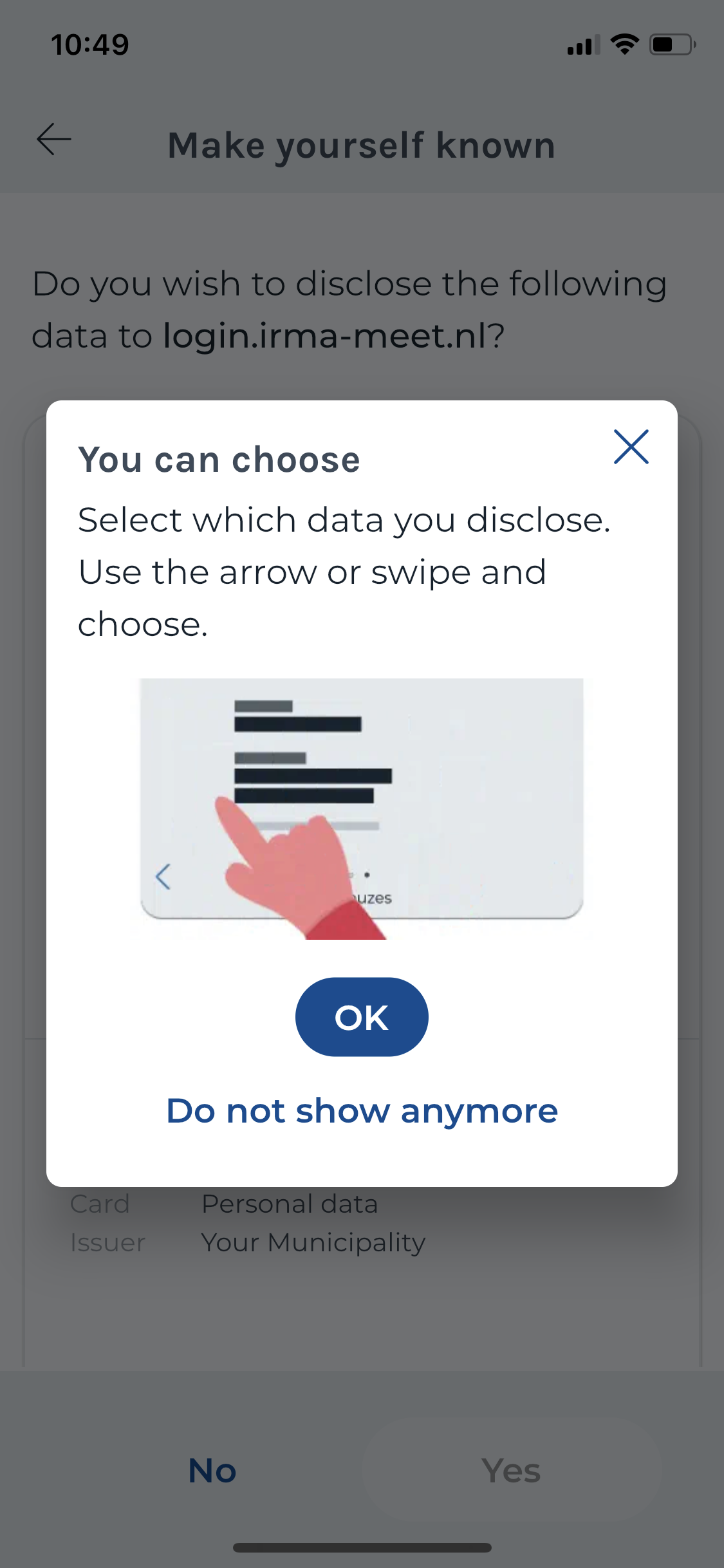
When looking at the old app, we expressed the worry that users might not understand that they only disclose the set of data that is currently visible. While the new app has improved the details and general look of the screen, the underlying concept remains the same. A key addition is that the new IRMA app has included a tutorial-overlay that explains how to use this screen (see screenshot). While this screen can benefit new users, the need to explain a screen often indicates an underlying problem.
As suggested in our earlier review, we believe this screen does not clearly communicate that one is only sharing the selected options. This still might be improved with a tiny text adjustment. Instead of always displaying the phrase “2 choices” independently of which option is currently selected, the app could display “option 1 selected” and switch to “option 2 selected” when the user changes the selection. (Of course, this would also work similarly for more than 2 options.) We expect this simple change to make it clearer that one selects what to share by swiping through the options.
When evaluating the disclosure sessions in the context of the card metaphor of the new IRMA app, we noticed that the disclosure screen is a bit odd. This is the case because the user’s data is now represented in a visually different way. In the wallet, data is represented in the form of coloured cards that fill the wallet. In contrast, on the disclosure screen, data is shown in a grey card that can combine pieces of information from several coloured cards. This can feel a bit inconsistent and can make recognition of the data more difficult. (A yet different type of card is used in the in-app overview of available cards. There, white cards that feature the card name and issuer are used.)
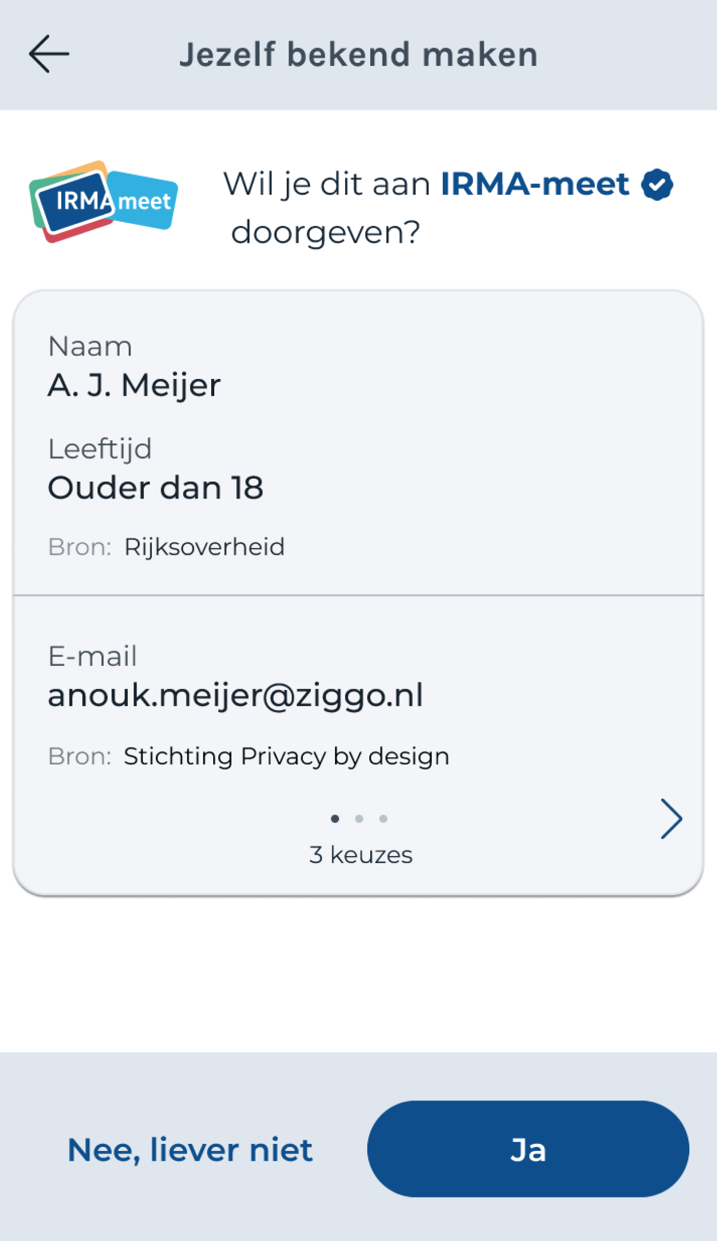
The card metaphor seems to be at odds with the fundamental principle of IRMA that you can selectively disclose relevant information (rather than always disclosing entire cards). To communicate this principle, individual pieces of information have to be able to stand on their own. Maybe in the future, the IRMA team can revisit the card concept to account for this. In fact, we have noticed a particularly nice design by Cláudia Pinhão that plays with this concept (see below). We suggest using this idea to inspire future iterations. Ideally, the data that users disclose can be represented consistently, no matter whether a user is loading it, viewing it in their wallet or sharing it.
Another concern we voiced about the old app is that it might not be clear to users why they can choose among sets of similar information from different issuers (e.g., their name issued by their bank and their name issued by their municipality). This likely remains confusing. One could improve this by making the difference (that they come from different sources) more visible. Also here, the design by Cláudia Pinhão (see screenshot above) is a good inspiration. It features small logos next to the individual pieces of information that give information from different issuers a distinct look and feel.
Obtaining missing data during a disclosure session
Users of the old IRMA app faced a major problem when they were asked to disclose information they did not have in their IRMA app. Simply put, they were told about the problem but not presented with any way to overcome it. This issue has been fixed, and users now can obtain missing data during the issuance process. E.g., if they are asked for their email address but do not have this in IRMA yet, a button is displayed to add the email address right away (see the screen below).
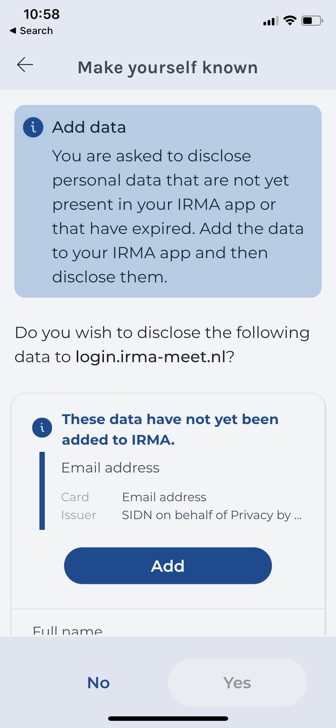
As soon as users have added the missing information, the flow is picked up where they left, guiding them towards completing their original goal. Compared to the process that the old app enforced, this is a massive improvement as users remain in a flow where each step brings them closer to their underlying goal.
Tiny back arrow in iOS
In the old app, we noticed that after disclosing needed data from an iPhone to a website, such as demo-website, one reaches the IRMA home screen. This was not ideal, as one ideally returns to the website that has requested the information.
Thanks to the development efforts of the Privacy by Design foundation, this is ideal behaviour can now be achieved easily in most cases. For this, the requesting party must set the right clientReturnUrl (have a look at the documentation). This specifies to which website or app the user continues after the successful IRMA session.
In cases where setting this clientReturnUrl is not an option, the old problem remains. However, the situation has been improved with a new screen that helps users notice the tiny arrow in iOS (see screenshot). Of course, this workaround is far from ideal — but it is better than users getting stuck. And luckily, clientReturnUrl should address the problem before it even occurs in most cases.
Card actions
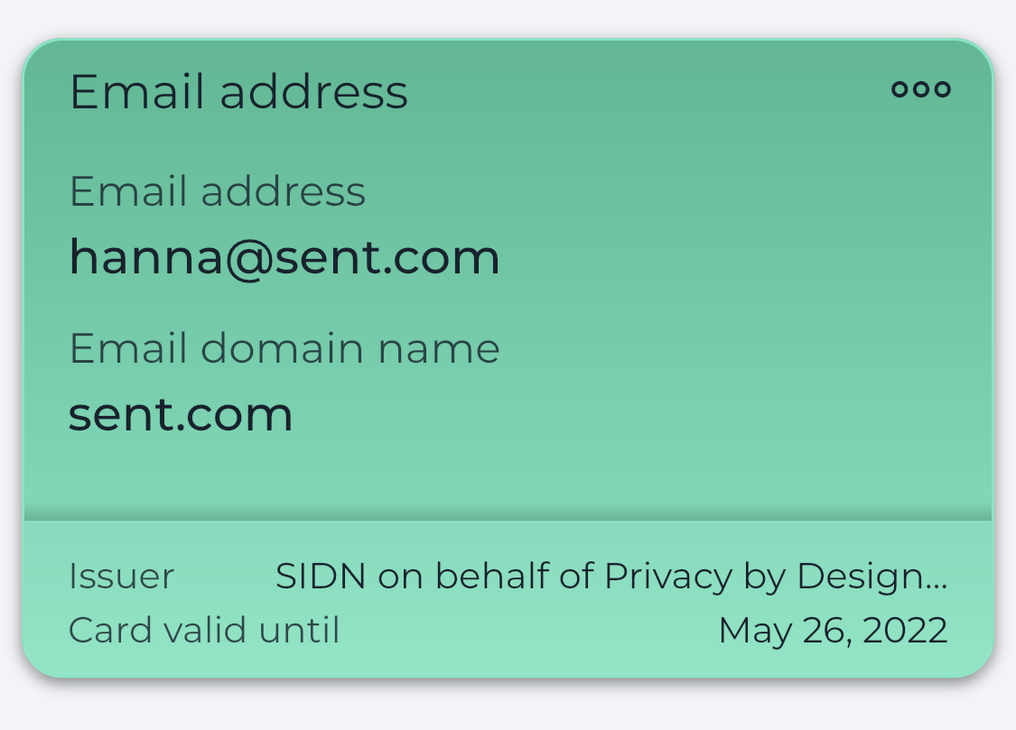
The data that users load into IRMA are visually represented in the form of cards. These cards contain one or more pieces of information that are issued together and that belong together. E.g., all data that describe a user’s address are combined on one address card. We now revisit issues that we have identified concerning card-related actions.
Deleting cards
In the old app, users had to long-press a card to delete it. We warned that some users might not be aware that long-pressing is an option. As suggested, the new app solves this problem by introducing a card menu (three dots on the top right corner of cards.)
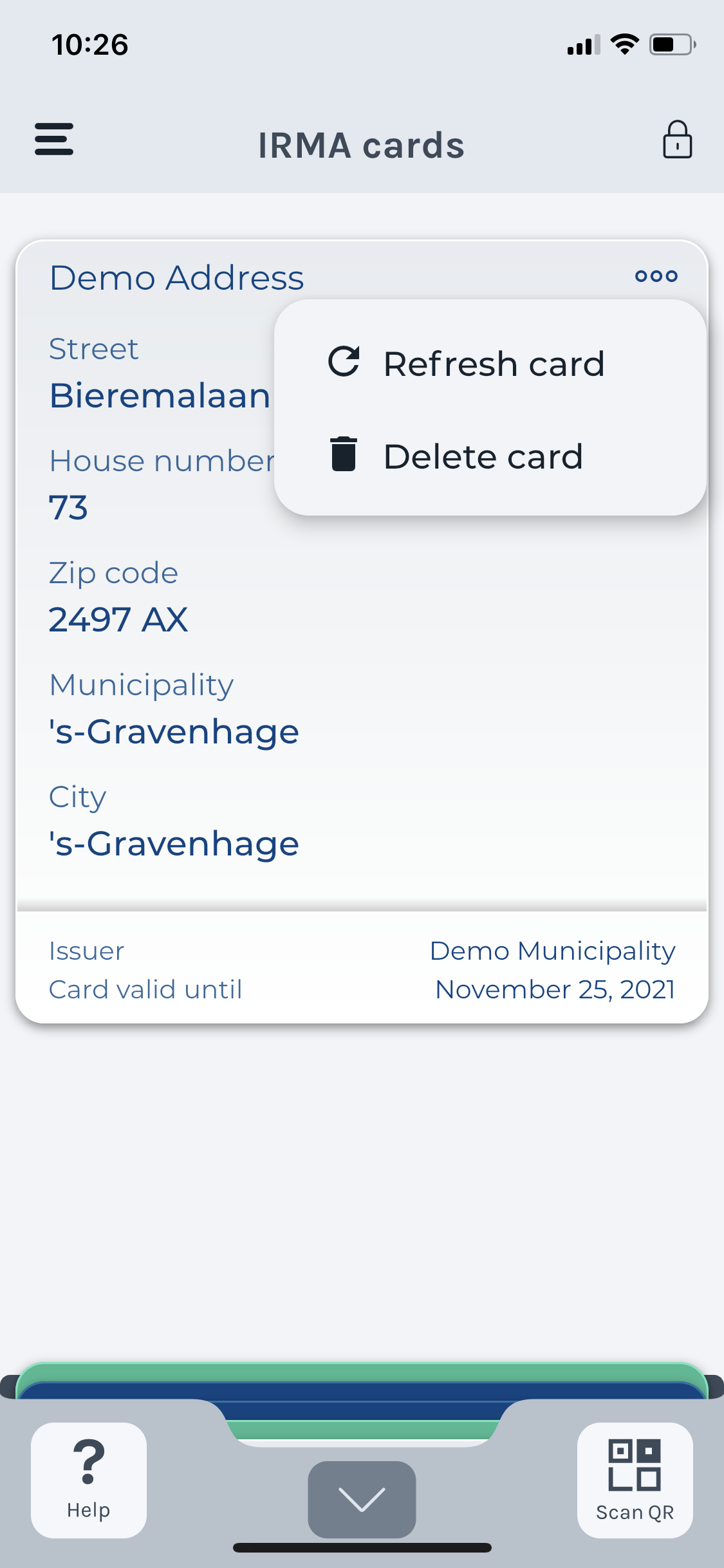
Refreshing expired cards
The data that one loads into IRMA is valid for a given period of time, determined by the issuer. If the data has expired, a user needs to refresh the attributes. We noticed in the old app that the refresh option simply means that one is obtaining a new card that replaces the expired card. This is the same in the new app. We believe this might be slightly confusing for users and suggest it would be better in terms of expectation management to invite users to “Get a new card” (or actually refresh the information).
Another small problem we spotted in the old app is that the expiration date of the data might not be clear. The new app has aimed to address this issue by trying out various wordings. It now states, “Card valid until” (see card above).
Correcting wrong information
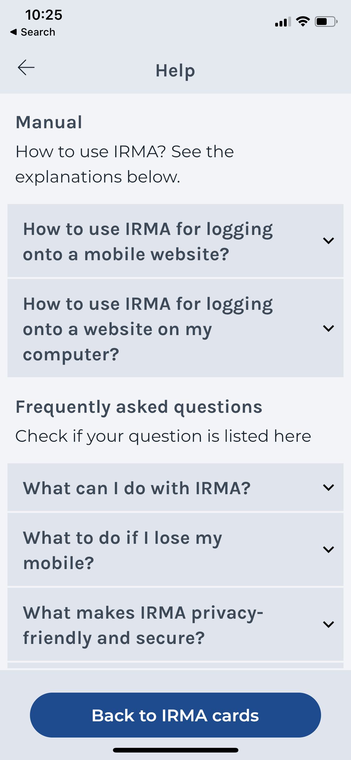
Some of the data that is stored in IRMA can become incorrect. E.g., one’s address and one’s last name can change if people move or get married. In such situations, users might want to correct this information. To do so, users can try to refresh the card. However, both the old and the new app leaves users without any guide whom to contact and what to do if this fails. We suggest including an item about this in the new help page of the IRMA app (see screenshot).
Reordering cards
Users might wish to personalize IRMA to their liking. Changing card colours and or the order of their cards might be something users might enjoy. In particular, users might want to keep important cards on top to keep an eye on their validity easily. Unfortunately, such an option is still not available in the new app. However, we believe it has little priority because users rarely interact with the information in their wallet. Most of the time, websites ask them for specific information that is displayed automatically — without the need for a user to look for it in their wallet.
Searching for cards
As mentioned, users typically do not have to search through the information in their IRMA wallet. However, as mentioned, a search or filter function might be interesting in the overview of available cards.
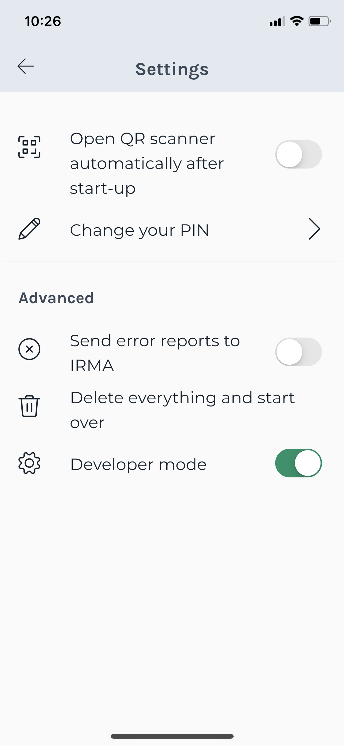
Deleting everything
The old app worked quite well when it came to deleting data. Yet, the new app includes some textual improvements. It now clearly describes the process as “delete everything and start over”. Also, as suggested, the option to delete everything has been moved from the main menu to a settings page that includes other actions that are not commonly used, such as changing the PIN code.
Home again
After deleting everything, the old IRMA app presented users with the home screen. The new IRMA app has improved this and now displays the initial screen presented when one has freshly installed the IRMA app for the first time. After deleting everything and starting over, it now is “as if they had never used IRMA before”.
Making IRMA easier: top five improvements
As we have seen, the IRMA app has become much better. We now summarise the five greatest improvements that impact the user experience. It might not come as a surprise that these align rather well with the biggest problems spotted in the old IRMA app. In our opinion, IRMA got better with respect to the following points.
1. Communication of the concept
The wallet metaphor, designed and contributed by Amsterdam’s UX team (and particularly Mike Alders), has made it much clearer to users what IRMA is about.
2. Keeping users in the app
The new app has reduced the need to switch to the Privacy by Design Foundation website to load common and useful data into IRMA. The in-app-overview is a great addition to the IRMA app. It also makes it easier to invite users to load data into the IRMA app, which is our next point.
3. Inviting users to load data into IRMA
The new app nudges users to immediately load useful data by displaying a button/nudge on the main page. (This button disappears after several cards have been added). We believe this intervention helps users to proceed after the onboarding.
4. Helping users to resolve problems
The new IRMA app helps users to resolve problems in various ways. It includes a help screen with FAQs and step-by-step instructions for common actions. It also includes the option to directly load missing data into IRMA during disclosure sessions. Furthermore, explanatory overlays and pop-ups have been included. These are presented at the spot and moment when people actually need them.
5. Presenting clear texts
The new IRMA app features a completely new set of texts. These have been designed with much care, keeping simple language in mind (e.g., using the website “ishetb1.nl” to check if words are too difficult).
And there is more…
Aside from usability issues identified in the old app, the new app also comes with additional improvements. A topic that we only addressed briefly in our previous review is accessibility. Nonetheless, we want to highlight accessibility as an important improvement of the new app. Due to limited resources during the development of the old IRMA app, accessibility never got the attention that it ideally would get. In the development of the new app, accessibility has been on the radar from the very start. (We also have written some blog posts about the efforts to make the new IRMA app accessible, see IRMA made accessible: first steps and IRMA made accessible: can you read this?) While there certainly are still some things to figure out (e.g., how well scanning QR codes works for blind people), the accessibility of the IRMA app is constantly improving. For instance, the recent app update 6.0.11 improved how IRMA works with screen readers (see version history).
While accessibility is often seen as something that benefits users with disabilities, we believe designing with accessibility in mind can improve the user experience for all users. (And we are not alone with this belief. Have a look at, e.g., the following articles: Why accessibility is good for all your users and Why Designing for Accessibility Helps Everyone.) The dialogue boxes in IRMA are an example of how accessibility improvements helped make IRMA better for everyone. We changed the IRMA app code to make those dialogues more accessible and removed an unnecessary on-screen element that would confuse screen readers. While this helps visually impaired users, the change also made the dialogue boxes less cluttered and clearer for everyone.
Open issues and questions
There is no doubt IRMA has made a big step forward. Yet, walking through the app revealed some remaining issues. We will summarize the most important findings in the following.
1. Consistency: how to present user’s personal data
One major issue that this review identified is that the new IRMA app uses three different cards to represent the information people can load into IRMA. In the wallet and issuance sessions, the information is presented with coloured cards. These cards share strong visual similarities with physical cards. When one wants to load cards into IRMA, the available cards are represented with white cards that are more button-like. And when one discloses personal information, grey cards are used that can combine snippets from various coloured cards. (What is more, the design element used to represent available cards in the in-app overview is used in a completely different manner in the history screen).
Keeping the representation more consistent can help users recognize that the data they share comes from their wallet and makes the underlying IRMA concept even clearer. In the long term, IRMA could explore another metaphor or visual representation of the user’s data.2
2. Issuance complexity
An issue that has not been solved with the new app is that obtaining cards is a complex journey that involves additional parties. If one leaves IRMA and ends up at an issuer website, it is still possible to get confused and wonder: where am I, am I doing the right things?
3. Is sharing data too easy (or too difficult)?
A final concern is that IRMA might make it too easy for users to share personal data. We believe IRMA already adds some friction to data sharing that can hopefully prevent people from mindless giving away personal data without giving it any thought. However, as discussed in detail in the scientific article “Think before you click: how reflective patterns contribute to privacy”3, we see quite some room for improvement. Simply put, sharing non-sensitive data could be made easier while sharing more sensitive data (BSN) could use more friction. Also, users could make decisions more globally by, e.g., approving all requests of a certain type from a certain party (for instance, all >18 requests from a gaming website). This way, users can decide once, rather than being bothered with the same types of requests again and again.
Conclusion and future work
We have reviewed the new IRMA app with respect to the usability issues we identified in the old IRMA app. This has shown that the new IRMA app is a big step forward and that many issues have been addressed. This was possible due to the great collaboration between the Privacy by Design Foundation, the Amsterdam team (which, among other things, brought in the wallet-design), the IRMA made easy team and the general IRMA community (especially active on slack).
While the new app is already much easier to use than the old app, we have also noticed that there is some work left to do. This expert review has identified some issues, but an expert review alone can never provide a complete picture. This is why the IRMA made easy team (and in particular Laura Loenen and Jorrit Geels!) have also done an extensive review of 10 different users tests and usability evaluations that have been conducted with actual users by different parties (mostly by Amsterdam). We subsequently grouped them into issues and invited all interested stakeholders (e.g., companies that use IRMA) to a UX roadmap meeting to discuss and prioritize the issues and brainstorm about solutions (we want to thank Anouschka Scholten for facilitating this meeting!). This meeting took place on 11 December 2020 and has revealed additional perspectives from both end-users and stakeholders.
In the future, we will follow up with a proposal for a UX roadmap. In this roadmap, we plan to integrate the findings from this expert review with the issues raised in the user test reports and discussed with stakeholders during the UX roadmap meeting. For now, we conclude that even though not all aspects of IRMA have become easy yet, using IRMA definitely has become much easier.
-
As mentioned, the wallet-idea was shared and developed in an open-source manner by the municipality of Amsterdam. However, implementing the wallet-idea really was a shared effort by Privacy by Design, Amsterdam and last but not least, the IRMA made easy team. ↩︎
-
IRMA could, for instance, be organized similarly to the music app Spotify. The IRMA app could represent credentials similar to music albums. Each credential would feature individual pieces of information, just like music albums feature individual songs. Just like it is completely natural only to pick a single song from an album to listen to, it might be natural only to share a single piece of information from a credential. And just like it is common to make playlists with songs from different albums, a disclosure request could ask for pieces of information coming from different credentials. Of course, such a metaphor would be weaker in many ways because albums and credentials have rather little in common (in contrast, ID cards and IRMA cards have a lot in common). Yet, it would be interesting to see whether the concept of credentials with individual pieces of information that can be shared selectively can be visually conveyed this way. ↩︎
-
A. Terpstra, P. Graßl, and H. Schraffenberger. Think before you click: how reflective patterns contribute to privacy. Position Paper at the Workshop “What Can CHI Do About Dark Patterns?” at the CHI Conference on Human Factors in Computing Systems (CHI’21), 2021. See https://darkpatternsindesign.com/position-papers/. ↩︎