Before testing an app with users, it is useful to get known problems out of the way first. After all, you want to learn something new rather than waste people’s time and annoy them with issues you could have fixed already. There are many methods one can use to identify problems oneself. With the NLnet team, we conducted an expert evaluation called cognitive walkthrough. With this method, we identified a list of key issues that should be addressed, and that we plan to fix in new and upcoming versions of IRMA. In this blog post, we will tell you a bit about our process, and provide a top five of recommended changes that will make IRMA easier to use for new users.
Cognitive walkthrough
A cognitive walkthrough is a usability inspection method. This means that one is not testing with actual end-users but with so-called experts who inspect the user interface with respect to its usability. This method is often used in combination with user studies.
Simply put, a cognitive walkthrough (CW) is a series of steps that helps evaluators to simulate what is going on in a user’s head when they try to complete a task with a certain interface.1 Concretely, the evaluators are guided by a set of four questions, which they have to ask repeatedly, at every step needed to complete a task at hand.2
In our CW, we were acting as the experts ourselves. When I say we, I mean my IRMA made easy colleague Paul Graßl and myself. Paul has a background in behavioral science and I have Human-Computer Interaction background. These backgrounds came in handy; but to be honest, an academic background is not really necessary to do an expert evaluation. In fact, one nice thing about the cognitive walkthrough is that one does not need much experience in the field to act as an expert. This is because the four questions that guide the CW help the evaluators stay on the right track and find potential problems.
In contrast to other usability inspections (such as the popular Heuristic Evaluation) the cognitive walkthrough focuses on one specific aspect of usability, namely ease of learning. It is based on the idea that users learn how to use an interactive application by actually using it, which is certainly true for many IRMA users. This is not a problem per se — but unfortunately, IRMA currently has quite a steep learning curve. In order to ensure people don’t give up during their first encounters with IRMA, we want to make people’s “learning by doing” process is as pleasant and intuitive and rewarding as possible.
Preparation
Several versions of the cognitive walkthrough exist. In the IRMA made easy project, we used the process described in “The cognitive walkthrough: A practitioner’s guide” by Wharton, Rieman, Lewis, and Polson (1994) as a basis, but followed the process more loosely.
As described in the paper, the first step in the CW is to define the inputs to the walkthrough. First of all, this entails defining who the users are.
IRMA has a very diverse user group. Essentially, IRMA is intended for everyone who uses a smartphone. This group consists of users with mixed characteristics (e.g., users with different ages, nationalities and professional backgrounds as well as different degrees of digital literacy. (This makes it quite challenging to place oneself in the users’ shoes.) In this evaluation, we decided to assume the user has some experience with using and installing mobile applications (e.g., social media or online banking applications). In the first task, we assume the user has absolutely no prior knowledge of and experience with IRMA. The subsequent tasks assume that a user has completed the previous task(s), but unless explicitly stated, we assume no other use previous of IRMA. In this sense, we really focus on the user experience of new users who learn how to use IRMA by actually using it.
After defining the user group, it is custom to define the tasks that the evaluators address in their evaluation. We chose the following seven common tasks that most users will attempt to complete with IRMA:
- Onboarding
- Obtaining attributes from the municipality
- Disclosing attributes from the municipality
- Obtaining missing attributes during a disclosure session
- Choosing which attributes to disclose during a disclosure session
- Card actions
- Deleting everything
Rather than just giving experts the tasks and let them figure out how to complete them along the way, a CW also provides the evaluators with the action sequence for completing the tasks. In this case, the action sequence was provided in person by Hanna, as she knows the app inside and out.
The final input to a CW is a description or implementation of the interface that needs to be evaluated. We used the actual IRMA app from the iOS app store and installed it on an iPhone X. (As the Android app is almost identical, this was deemed sufficient.) We used IRMA versions 5.6.2 and 5.7.0 as a basis for the test. We did not assess the redesigned and upcoming version of IRMA, as this version was still very much in flux. (However, as mentioned below, we are now using the insights gathered about IRMA’s qualities and weaknesses to ensure the new IRMA app learns from mistakes made in the past without losing elements that work well).
Analysis
After defining the inputs, it was time for the analysis phase. In this phase, we walked through all tasks, following the action sequences needed to complete the tasks. At every single step, four questions helped us identify any potential issues. As described in the guide “The cognitive walkthrough: A practitioner’s guide” by Wharton, Rieman, Lewis, and Polson (1994), we asked the following four questions:
- Will the user try to achieve the right effect?
- Will the user notice that the correct action is available?
- Will the user associate the correct action with the effect they are trying to achieve?
- If the correct action is performed, will the user see that progress is being made toward the solution of their task?
These questions sound a bit weird at first, but they become quite clear when put in context. Imagine, e.g., that an IRMA user is trying to log in at a website but the required attribute has expired. The overall goal would be to log in. However, to do so, the user first needs to refresh the expired attribute. The four questions for this next step would now be:
- Will the user try to refresh their attribute?
- Will the user notice that the refresh button is available?
- Will the user associate the refresh button with the refresh action (do they understand that this button does what they want to do)?
- After the user has pressed the refresh button, will the user see that they have made progress towards refreshing the attribute?
Whenever the questions are answered, there are two possible main outcomes: Either the answer to all questions is a yes — or the answer to at least one of the questions is a no, indicating that the interface could use some improvements. To ensure evaluators do not just follow a hunch, a plausible success or failure story is provided that takes the user’s background, their preexisting knowledge, and characteristics into account. Also, the evaluators keep an eye open for and document all kinds of relevant information. For instance, it can be noted down what users need to know in order to complete the task, and issues such as misspellings can be noted down as well.
We did follow this process a bit more informally and focused on noting down potential issues (rather than also documenting success stories). Afterwards, we prioritized the issue and brainstormed about solutions. In the following, we document the main findings and present some initial ideas for improvements. Many suggestions are inspired by either the IRMA development team or by mockups that have been presented by the IRMA community over the last couple of months, and in particular demos and prototypes by Amsterdam’s UX team that is working on the user experience of identity managers.
Main findings
Task 1: Onboarding
In order to use the IRMA app, the user needs to install the app and set it up. Based on the CW, we expect the installation itself to go smoothly. However, during the onboarding, we encountered a few issues.
First impressions count: Information screen issues
The app currently features three explanatory screens that inform new users about IRMA (see screenshots below). We believe it is great that these screens explain what IRMA is (screen 1) and present two benefits of using IRMA (screen 2 and screen 3). However, with the strong nudge (the big blue button) to open an account on the first screen, we believe the option to learn more is likely to be skipped or overlooked. What is more, the color contrast between font and background seems rather low, which might cause accessibility issues. Furthermore, the screens look a bit crowded and unbalanced. Given that the concept behind IRMA is likely rather new to users who have not used the app before, it might be beneficial to guide users through the information rather than allowing them to skip it.
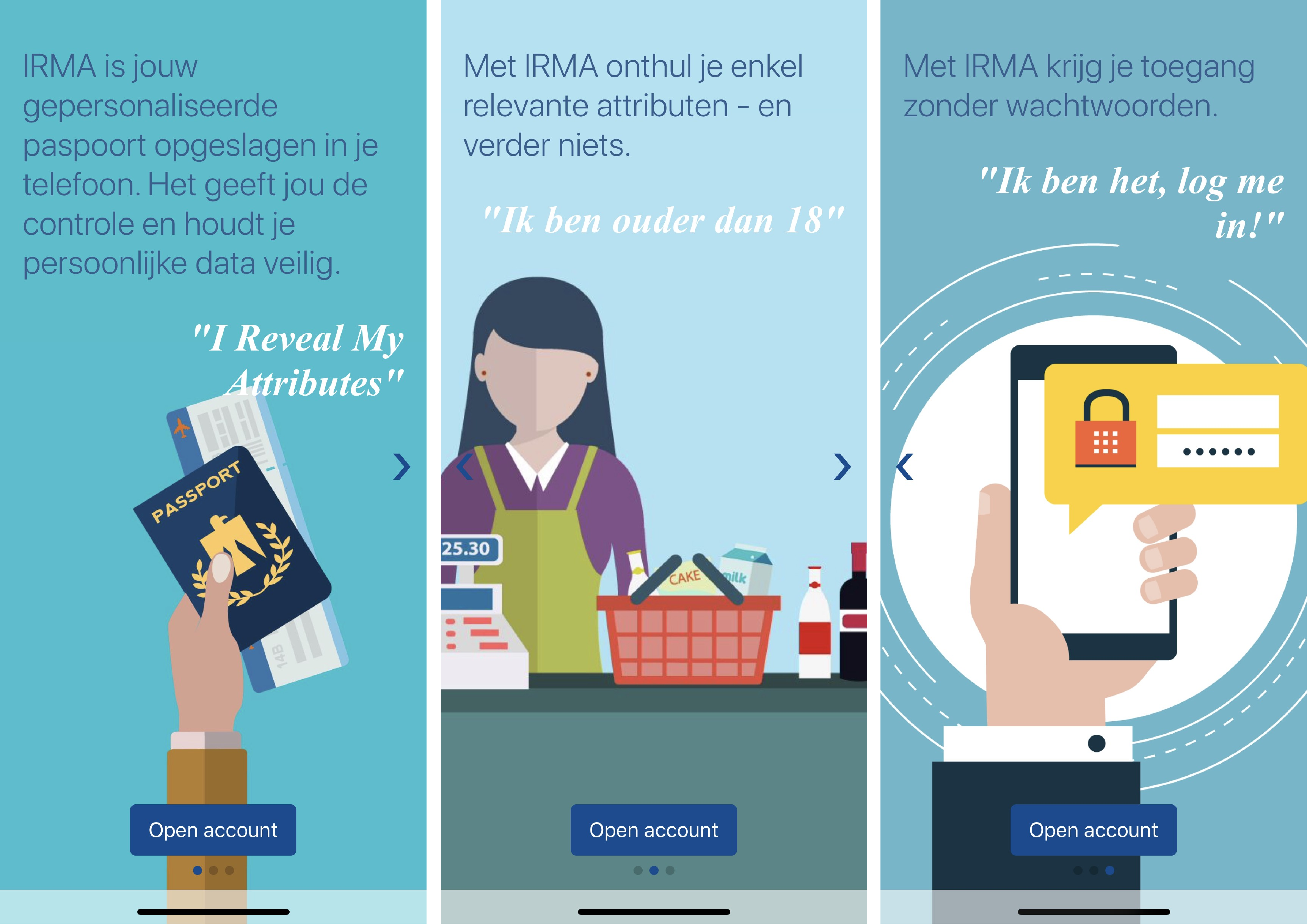
One rather tiny detail we noticed is the barely visible bottle of wine on the second explanatory screen, which is needed to understand why one would have to prove one is at least 18 years old.
Help users form the right mental model: What is an attribute, and why do you need an account?
Furthermore, we noticed some more issues with the texts. First of all, as seen on the screenshots above, the IRMA app asks the user to open an account. An account is typically associated with online-activities and “the cloud”. IRMA, in contrast, makes sure users’ attributes are only stored locally, on their own phone — the IRMA app does not come with “a cloud”. Even the organization behind IRMA cannot access the information that people put into their IRMA app.3 Hence, we think that the terminology here is misleading and might evoke the wrong mental model.
Another central word that can cause confusion is the term “attribute”. This word is used to denote the pieces of information that one collects in the IRMA app. Here, too, some associations can lead a user down the wrong path. E.g., in the Netherlands, the term is often associated with actual objects (“voorwerpen”). It might be more natural to use terms like “personal information” or “data”. Similarly, in Dutch, speaking of “gegevens” might give rise to a more accurate association than speaking of “attributen”.
Aside from the specific words that are used, we also noticed that there is a rather large amount of text that people encounter during their first steps. This can be off-putting, and we expect many people to actually skip reading the text.
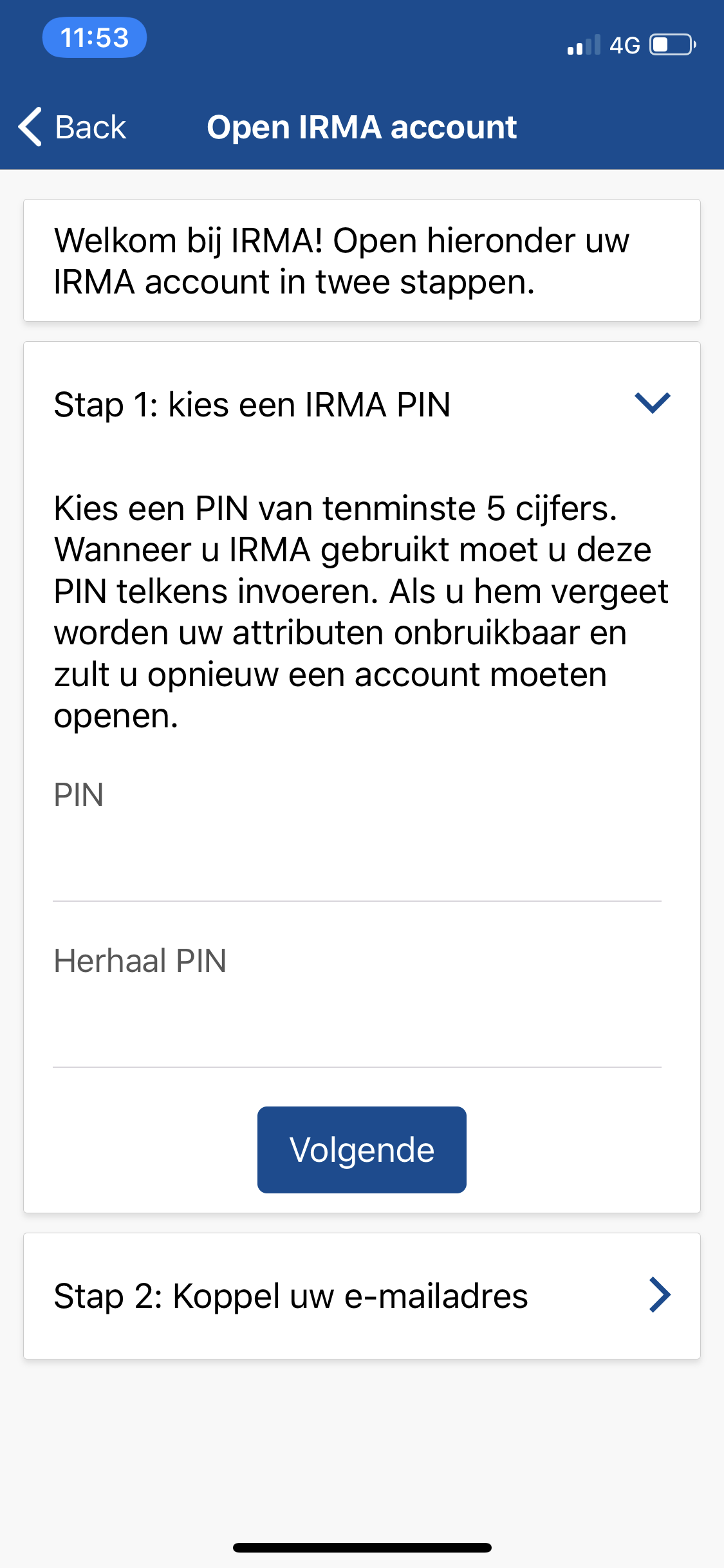
Choosing a PIN: Finding the right balance between usability and security
The first real task that users have to complete when starting with IRMA is setting up a PIN (see screenshot below). Unfortunately, the instructions here can be a bit confusing. The text asks users to choose a PIN of at least 5 digits. This can be puzzling because determining the number of digits oneself (without any upper limit) is very uncommon.
From a usability perspective, having a PIN without a clearly defined length is problematic. When the PIN length is known in advance, one can use constraints that guide the user, e.g., in the form of 5 boxes. Such clear visual indicators not only prevent users from filling in too little or too much but also have the advantage that one can move on to the next step automatically once the required number of digits has been entered. However, as using a PIN of, e.g., 5 or 6 digits also comes with certain security disadvantages (longer PINs of unknown length are obviously more difficult to guess or brute force), this might not be acceptable for everyone. We suggest that security experts, together with UX experts address this problem together. A possible solution, which was suggested by early IRMA adopters, is to use a default PIN of 5 digits, but allow users to chose longer PINs via the app settings. This actually might be the compromise that offers the right balance between security and usability.
Another issue we noticed at this step is that insecure PINs (like 12345) are allowed. We believe, users who have not used IRMA before might be inclined to choose a simple PIN because they have not put any valuable or personal data into the app yet. Hence, they will not experience the need to protect the app as strongly as users that have already added sensitive data, such as their BSN. Due to security (rather than usability) reasons, we believe that it might be better to prohibit too simple PINs. We expect that users will accept restrictions and slight inconveniences because they will understand that such measures are meant to protect their data. Ultimately users might even feel more at ease with the app knowing that it helps them to secure their data properly.
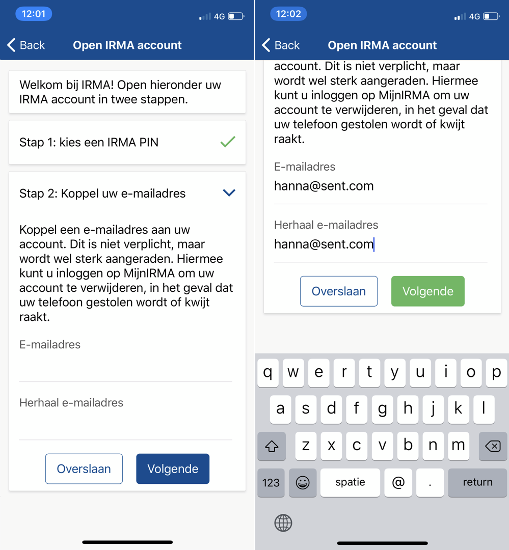
After submitting the PIN, the next logical step is to link the app to an email address. This e-mail account can be used to block one’s IRMA account in case the phone is lost or stolen. While it is quite clear that providing an email address is the next step, it is not necessarily clear what action is required to get there. In other words, the third question of the cognitive walkthrough, namely “Will the user associate the correct action with the effect they are trying to achieve?" cannot be answered with a definite yes. This is because two actions fight for the user’s attention. On the one hand, there is a big primary blue button labeled “Volgende” (en: “Next”), that seems natural to tap. At the same time, there is a card that is clearly labeled *“Stap 2”(en: “Step 2”). Users might feel compelled to tap on the card to proceed with the second step. Ultimately, users might be unsure which of the two actions to complete and wonder how to move forward. Fortunately, either choice is fine, and in both cases, users are invited to enter their email address.
Another detail we spotted during the onboarding is the blue button to proceed after one has filled in the email address (see screenshot below). This button turns green and only can be used once the same valid email address has both been entered and re-entered. However, the initial blue color of the button (see left side) implies that the button can already be tapped before one is done. In our opinion, it would be better to grey out the button while it is inactive and make it turn it blue (like all other active primary buttons) once the process has been completed successfully.
Completing the onboarding
After successfully completing the onboarding, one is presented with a success screen (see screenshot below). Giving users feedback about the completion of tasks is, of course, good. However, there is room for improvement. As discussed above, speaking of attributes and speaking of an account might be confusing, especially for new users. Furthermore, the button with the label *“Klaar”(en: “Done”) implies that users are done. However, the text also suggests that users can now load personal attributes into the app, which is not possible on this screen itself. Because of this, the text remains rather abstract. To mitigate these issues, we thus suggest inviting users to load attributes on a screen where they can actually do so. Furthermore, the success message could be shown with a quick snack bar. Hence, we doubt this extra success screen (and extra action of tapping “Klaar”) is needed and suggest to incorporate its elements in the home screen.

Arriving on the home screen for the very first time
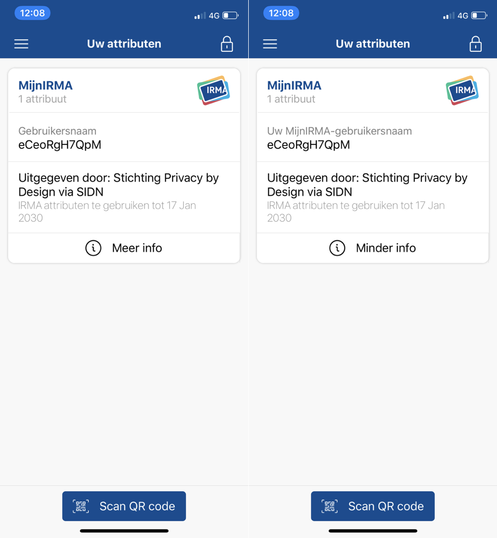
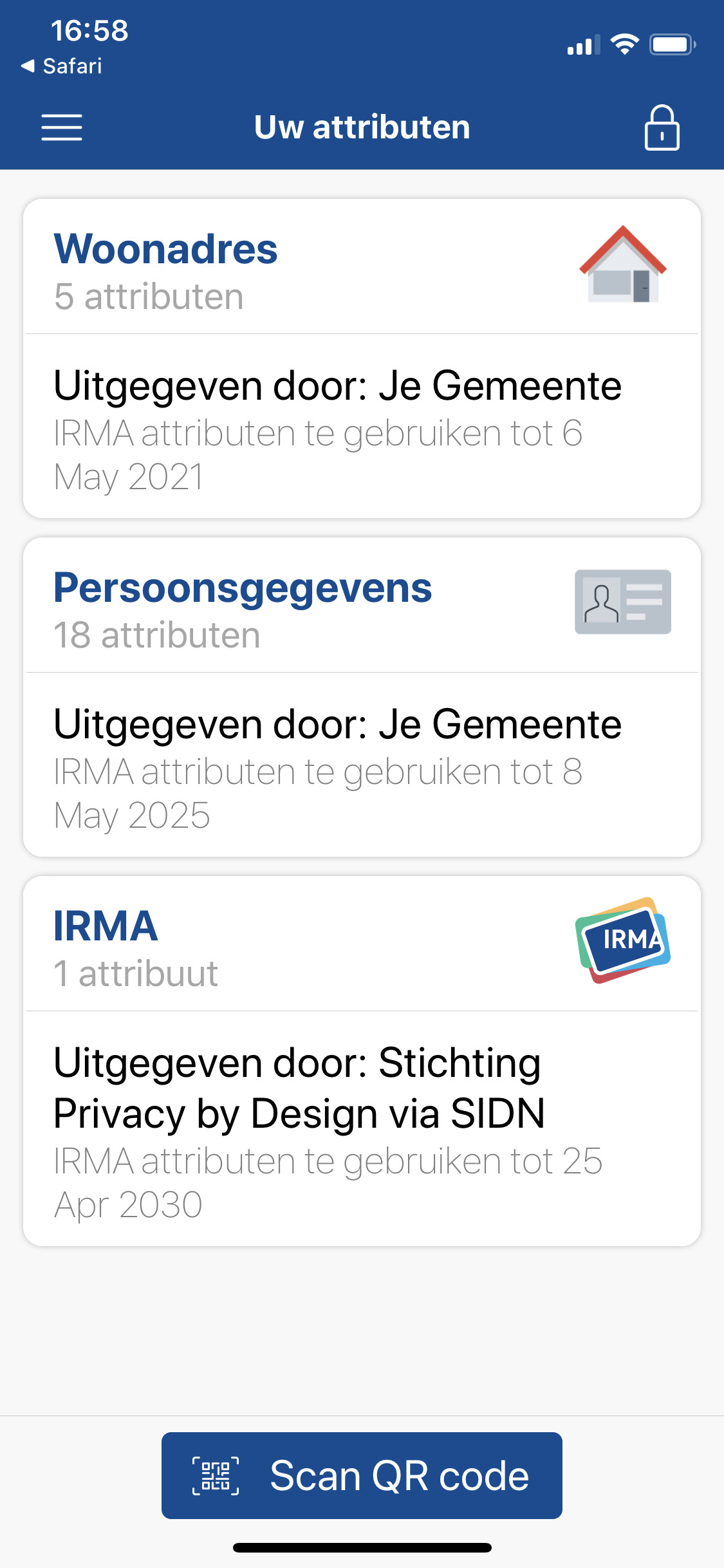
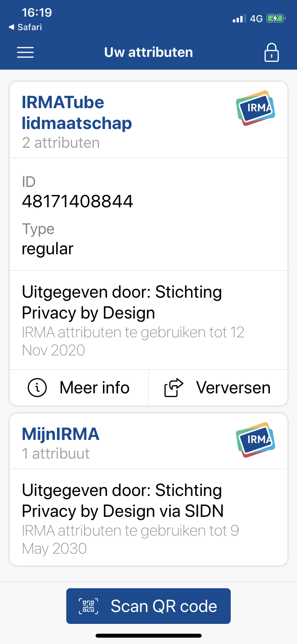
After one has completed the onboarding, one arrives on the IRMA home screen (see screenshot below). This screen is titled “Uw attributen” (en: “Your attributes”) and contains the data that a user has loaded into the IRMA app. On the very first usage, however, this screen is rather confusing. Ideally, a user would now continue to load personal information into the app (IRMA is useless without doing so). However, if we look at the four questions of the cognitive walkthrough, some things might go wrong.
Already the first of the four questions, namely “Will the user try to achieve the right effect?" (in this case “Will the user try to load attributes into IRMA?") can be answered with a “No”. In our opinion, it is more likely that a user who arrives on the screen wonders “now what?" and explores the information and possibilities for action that are prominently displayed on the screen. The most prominent piece of information is the white card that is labeled “MijnIRMA” (en: “MyIRMA”) and that contains one ‘attribute’. In our opinion, it is not clear what this card is, what it is useful for, and why it is there.
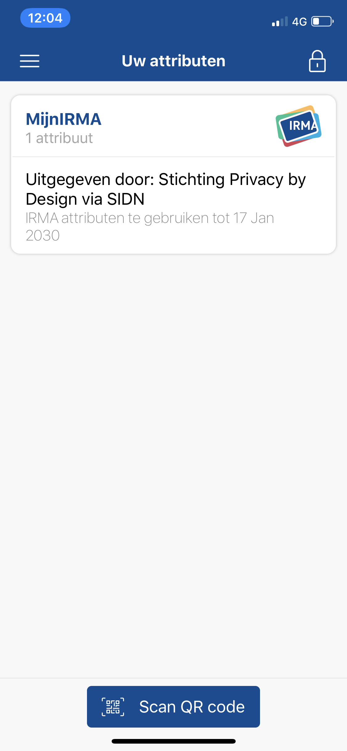
What is more, toggling more information by expanding the card and tapping the “More information” icon reveals the same (rather uninformative) information in slightly more words rather than actual answers for the questions that a user might face (see screenshots below). A quick way to improve the user experience would be to explain the attribute by providing more meaningful text.
When it comes to actions, the user is presented with a big blue button labeled “Scan QR code”. This seems to be the call to action at this point. However, this button comes as a surprise. A new user might wonder “why?" and “which QR code?" and might not be sure how to continue. In our opinion, it is quite likely that a user who is not provided with any other instructions now explores the menu of the app. However, some might also just close the app at this point.
Our main realization regarding the onboarding is that after the onboarding, one is not ready to use the app, as it does not contain personal information yet. In our opinion, the first use experience should help users get the IRMA app into a state where they can actually use it for something. Of course, what information a person needs to load into IRMA differs from use case to use case. However, there are some pieces of information that are quite universally useful, such as the personal information (name, date of birth, etc.) from the Dutch population register (nl: Basisregistratie Personen, or ‘BRP’) that is issued by the municipality of Nijmegen. We believe, after setting up IRMA, users should have at least one meaningful card in it and this card with personal data is a good option, at least within the Netherlands. In line with our earlier suggestions, a key recommendation for improvement is thus to provide a clear nudge to load personal data into the app and thus guide the user further once they arrive on the home screen. (The same idea has also been suggested by UX experts in the IRMA community and we know it is planned for a future version of IRMA.)
Task 2: Obtaining attributes from the municipality
One strength of IRMA is that a lot of information can be loaded into it. In this scenario, we assume a user has completed the onboarding and intends to load personal data into the app. We assume the user has no clear idea what attributes are available and useful.
Leaving the app to load attributes
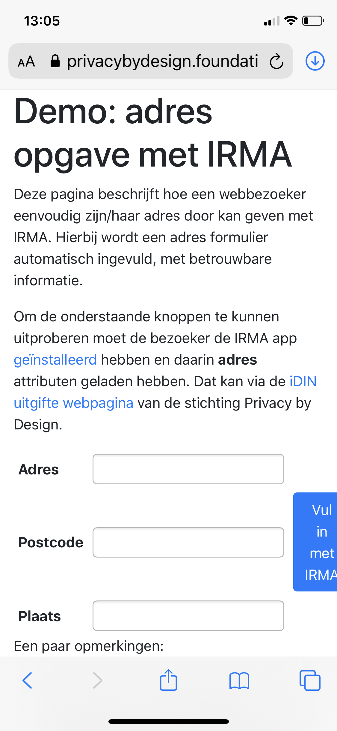
To load attributes, a user starts on the home screen (see screenshot above). As discussed, there is no clear invitation to load attributes on this screen. Yet, it is likely that users explore the menu to get closer to their goal. In the menu, the option “Verkrijg meer attributen” (en: Obtain more attributes) is pretty clear and guides the user into the right direction. However, after selecting this option, users face a surprise: they are now presented with the website of the Privacy by Design Foundation (see screenshot below).
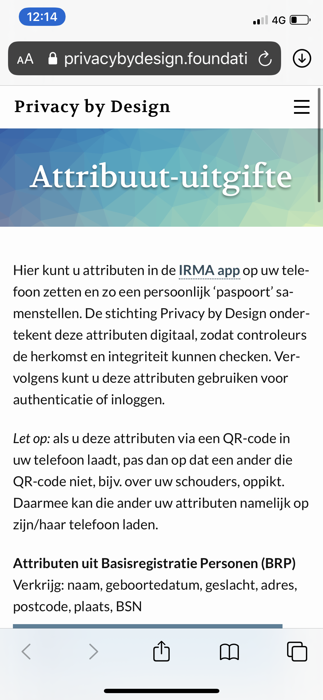
Here, the fourth question of the cognitive walkthrough (“If the correct action is performed, will the user see that progress is being made toward the solution of their task?") cannot be answered with a definitive yes. On the one hand, the text and heading on the website clearly indicate that attributes can be obtained. On the other hand, one is no longer in the IRMA app and might feel as if one has navigated away from one’s goal. The large amount of text on the website might make it seem as if one is on an information page and the different look and feel between the app and the website might unsettle users. Furthermore, the connection between the Privacy by Design Foundation and the IRMA app can be unclear to new users (it is explained briefly in the text though).
A key suggestion is to include the issuance-page (see screenshot below) into the app itself, so people do not navigate out of IRMA at this point. This would also be useful because switching between apps (e.g., IRMA and browser) can be quite confusing in general.
Another detail that stands out is that the information from the Dutch population register is promoted with a term new users likely do not know. Not everyone will have heard of the “Basisregistratie Personen” and the abbreviation “BRP”. Furthermore, the Nijmegen logo that is put next to the name might be confusing for users who do not live in this municipality (see screenshot above). Also, we noticed that the icons have a poor color contrast, and especially the colors of the Nijmegen logo do not stand out on the color of the buttons. Finally, the buttons do not necessarily have the look and feel of buttons, and the affordance to click or tap them could be increased by using a more typical button-look (e.g., using slightly rounded corners and elevation).
In case the list of available attributes grows considerably, we suggest a filter or search function that allows users to quickly find the data they are looking for. However, this is not yet needed.
Issuance website
We cannot predict which attributes a new user will load, but we assume that many new users will attempt to load the personal information (name, date of birth etc.) from the Dutch population register (nl: Basisregistratie Personen, or ‘BRP’) that is issued by the municipality of Nijmegen. This is because those attributes currently provide trustworthy and comprehensive personal data. If one chooses this option, one navigates to a website of the municipality of Nijmegen (see screenshot below).
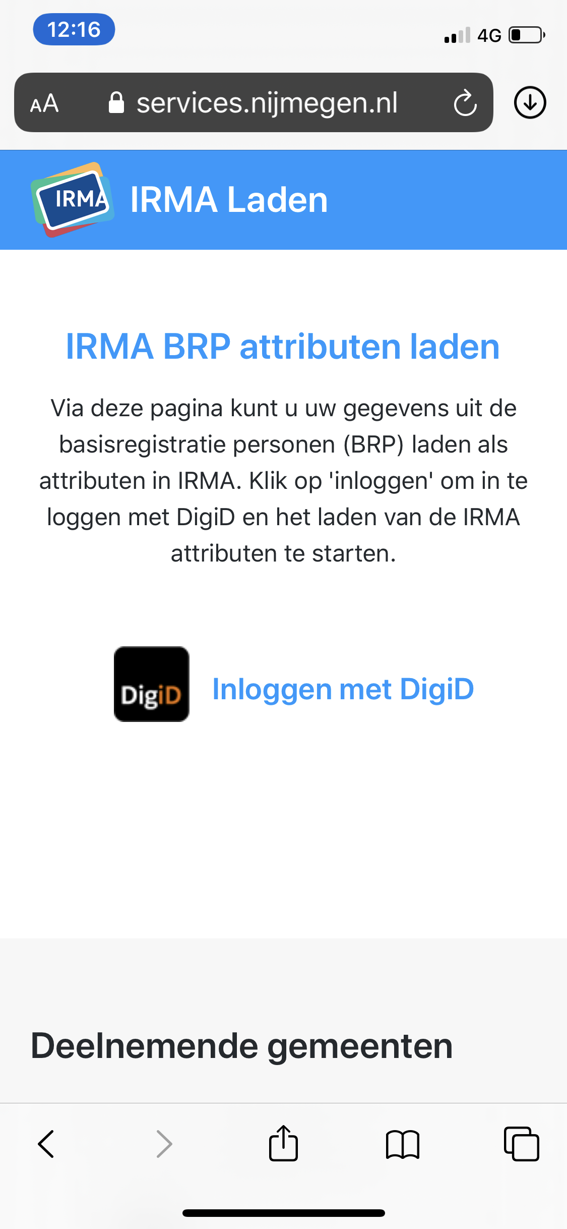
Something positive that jumps out here is the IRMA logo on the top left, which gives users confidence that they have moved in the right direction. However, the site faces a similar problem as the website of the Privacy by Design Foundation: The option to login with DigiD does not look like a link or a button and there is little affordance to click or tap it. However, given that there is little else one can do, we expect users will be able to select the option.
The text on this site informs users that they need DigiD. If the issuance process is reworked and if the option to load attributes is incorporated into the IRMA app, it would be good to inform people that they need DigiD as soon as possible, so they do not run into the problems of searching for their DigiD login-information somewhere along the way. Likewise, it should be clear that this information is only available to people living in the Netherlands. More generally, for each attribute, it should be clear in advance what the requirements are to obtain it.
Where am I now?
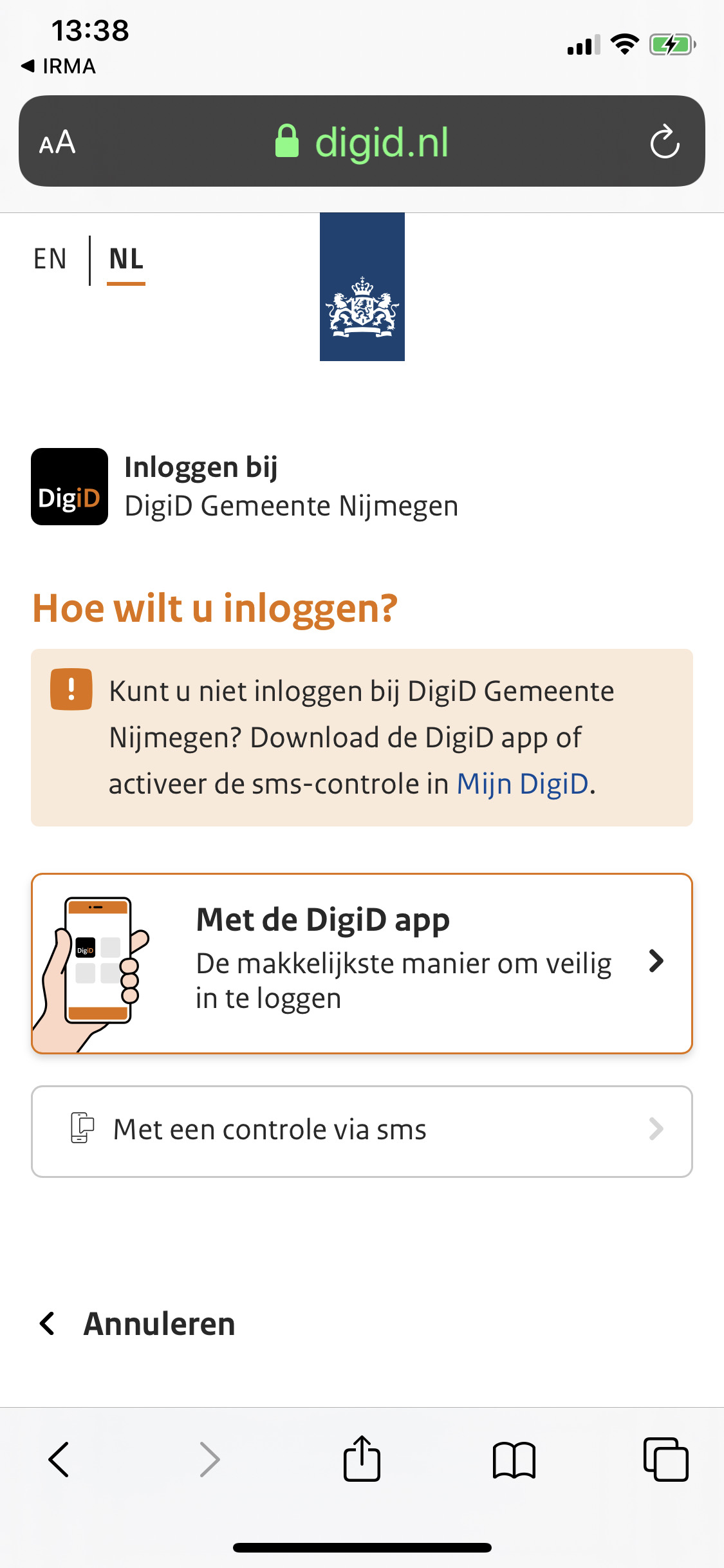
If one chooses to login with Digi, one navigates to another website yet again, namely digid.nl (see screenshot below). Although this navigation move in itself is logical it can get quite confusing at this point when looking at the bigger picture. The user has started in the IRMA app, visited the Privacy by Design Foundation website, then moved on to the issuance website of the municipality of Nijmegen and has now reached yet a different website from DigiD. To make things even more complicated, this site then invites the user to make yet another switch and suggests to open the DigiD app (see screenshot below).
Unfortunately, we see little means to improve this frequent switch of websites and apps technically. However, users could potentially be prepared better for this process, by briefly describing what they can expect in advance. Hence, when issuance is improved, sketching out the corresponding course of action in advance can help users to prepare them for such more complex journeys that involve many different parties.
Fortunately, the DigiD process continues smoothly. Upon completing the DigiD authentication, users are returned to the Nijmegen website, which in turn leads users back to the IRMA app. Although there are many steps involved, the process goes naturally. Once back in IRMA, users can confirm that they want to add their personal data into the app, and ultimately are presented with the new personal information in their IRMA app (see screenshot below). Seeing the new information in the app serves as a clear indicator that they have successfully achieved their goal. A tiny surprise might be that users are receiving two new cards, one with their address and one with other personal information such as their name. This might be surprising at first, but we do not foresee big problems with this separation into two cards.
Task 3: Disclosing attributes from the municipality
IRMA can be used for many different purposes where the disclosure of (personal) information plays a role. For instance, one can user IRMA to log in at websites, to sign documents, or to automatically fill in online forms. In essence, all of these processes work the same way. In each case, the user is asked to disclose some information to a third party with their IRMA app. In the following, we evaluate the ideal case, where a user already has the requested information loaded into the IRMA app. In order to assess this process, we use the demo provided by the Privacy by Design Foundation that asks users to disclose their address.
Disclosing information works slightly differently, depending on whether the website that asks for the information is visited on the same phone on which IRMA is installed, or on another second machine (e.g., a desktop or laptop computer). We have evaluated both flows.
Towards one recognizable IRMA button
On the mobile phone, the first thing we noted is the “Fill in with IRMA” button, which does not fit on the mobile page (see screenshot below). This is not a problem with IRMA itself, but rather with the website requesting the address.
On a desktop computer, the button looks fine. Yet we believe the button could be improved by giving it a clear standardized design. Ideally, IRMA could have an easily recognizable "IRMA button" that looks the same on every single webpage that offers IRMA services. This can foster recognition and help people quickly find what they are looking for. Also, it might contribute to a more professional and coherent IRMA experience across different websites and services. Depending on the context, the button could have slightly different labels such as *“Login with IRMA”, *“Sign up with IRMA”, “Prove with IRMA” and the more general “Continue with IRMA”.
Helping users obtain IRMA
Another thing we noticed is the pop-up that one gets to see when clicking the “Fill in with IRMA” button on a desktop computer (see screenshot below). This pop-up features a QR code that can be scanned with the IRMA app.
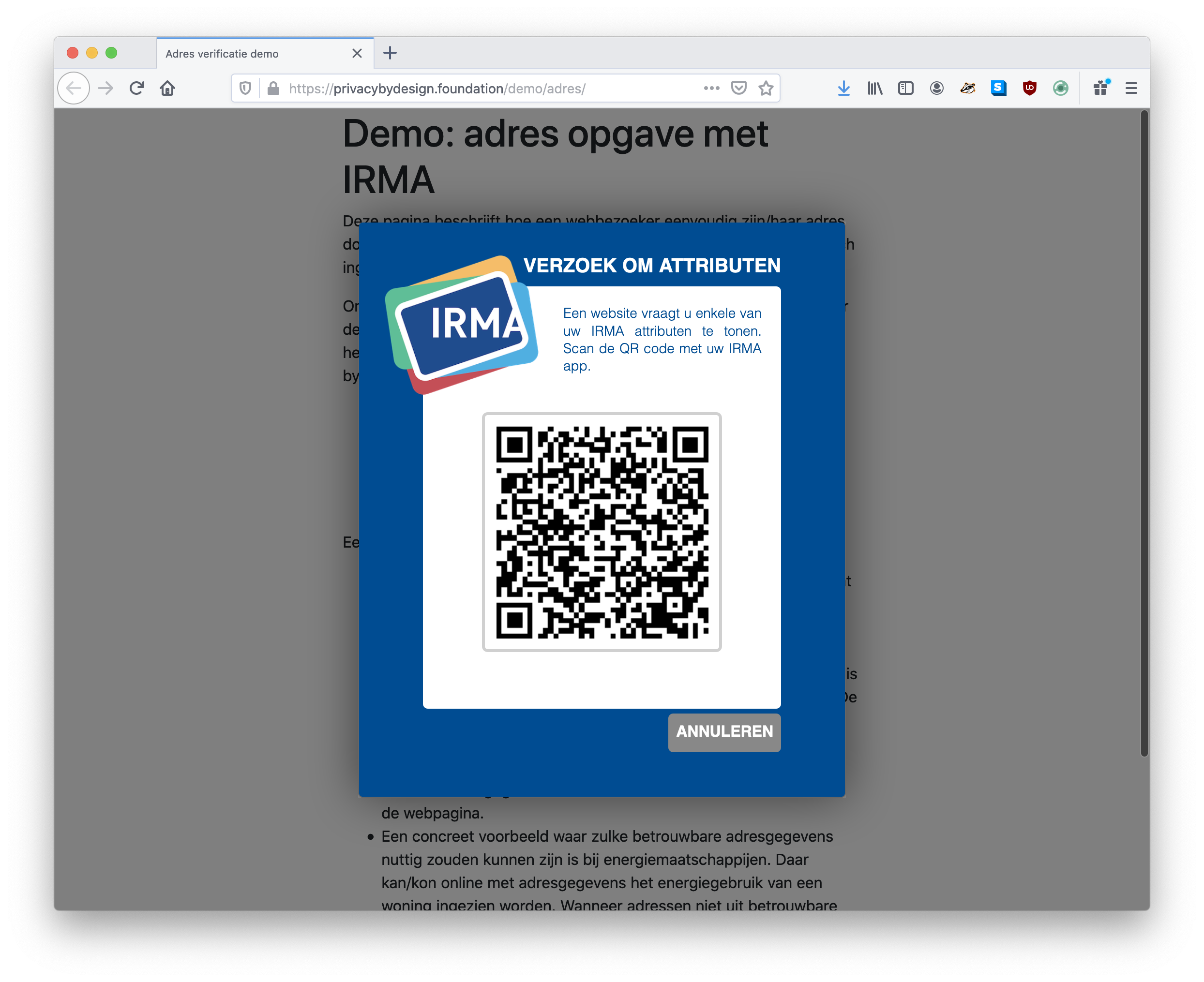
Three main things can go wrong here: First of all, not everyone will have IRMA installed here. One can argue that the website needs to prepare users well, so they do not end up with this pop-up if they do not have IRMA installed yet. However, the IRMA team can also support new users and ensure they do not run into problems at this step. E.g., a link to the IRMA website could be included in the default popup that is provided by the irmajs JavaScript library. Of course, this is not really an app issue, but it still affects the IRMA user experience, which is why we mention it nonetheless. (In this evaluation, we assume a user has IRMA installed, but if this is not the case, new users need to follow the process discussed above in task 1).
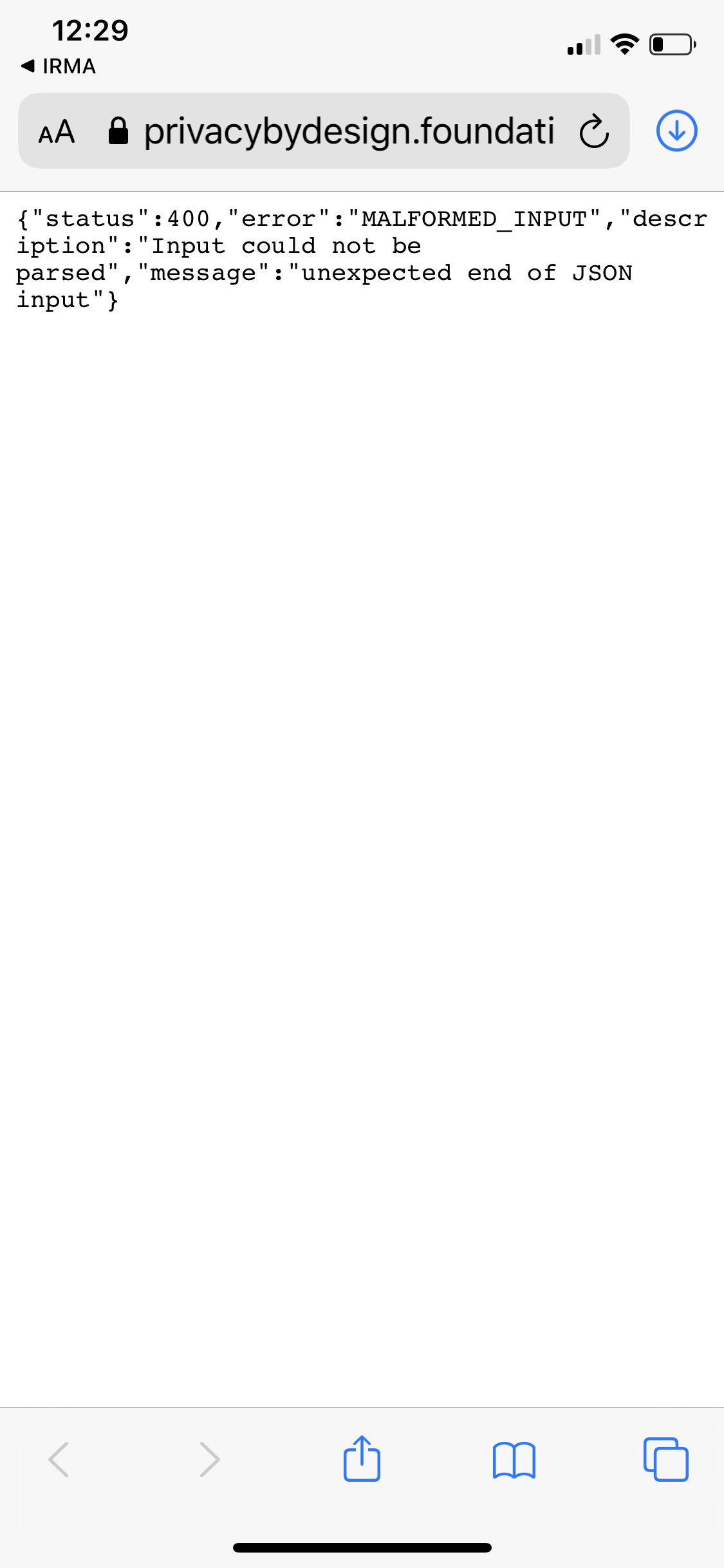
A second potential issue is that people scan the QR code with their normal camera or another QR-code scanner app. If one tries to do so, this currently yields an unformatted error that is displayed in a browser (see screenshot below). This could be addressed by automatically opening the IRMA app if they scan the QR with their device camera, and (upon entering the IRMA PIN) proceeding with the session in IRMA.
A third problem that can arise here is that switching between IRMA on the one hand and the website that requests the information, on the other hand, can be difficult — especially for those users who visit the website on a PC and thus have to switch attention back and forth between their phone and their computer. Fortunately, we already heard that IRMA developers are exploring how to guide the user’s attention from one device to the other at the right moments.
What you see is what you share
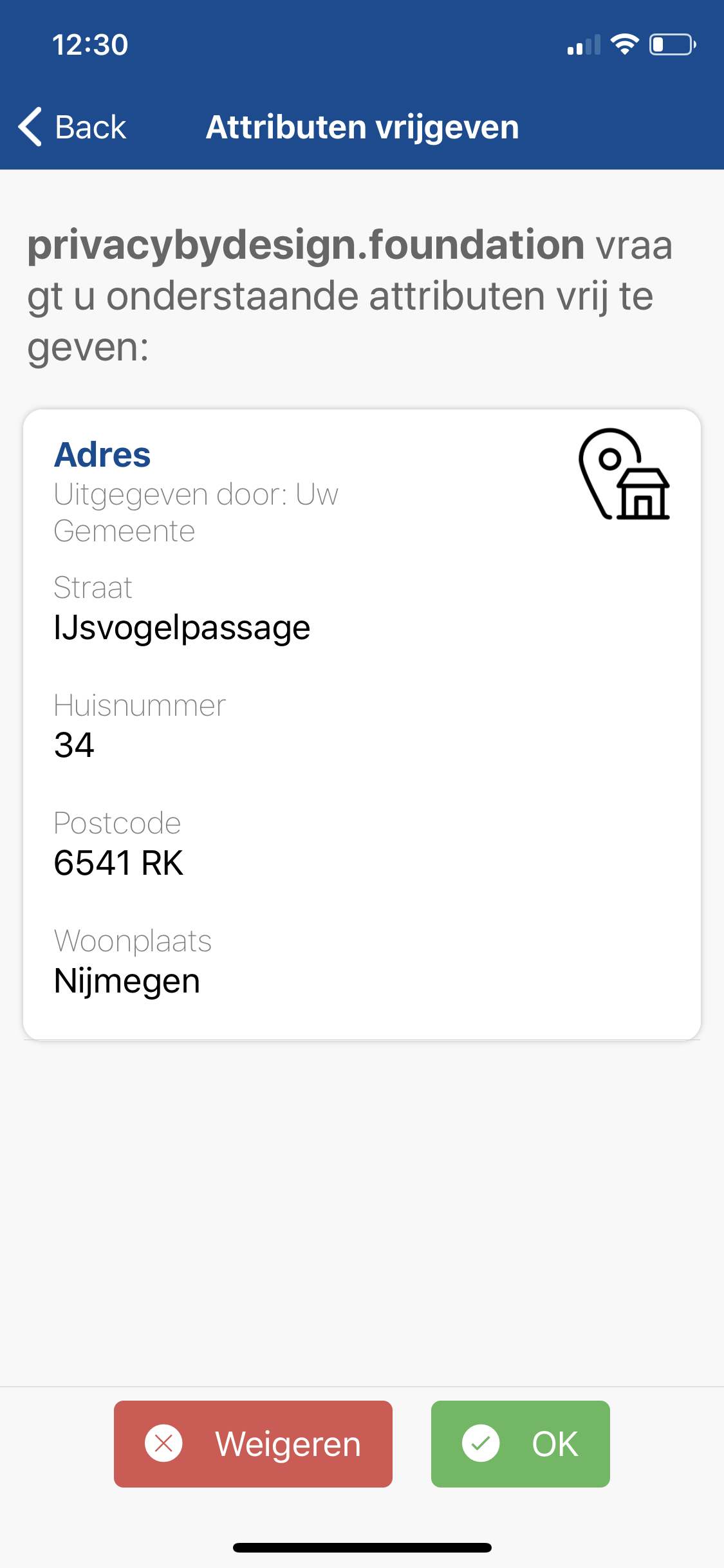
After scanning the QR, users reach a disclosure request screen (see screenshot below). Although a cognitive walkthrough focuses on problems, we want to also positively point out that on this screen, the user is explicitly asked for consent, and is clearly shown what information one is asked to disclose.
Aside from text-changes (e.g., the word “attributes” again), we recommend not to change much on this screen. The concept “what you see is what you share” seems simple and effective in this context. The need to give consent is in line with IRMA’s goals of users being in control of what information they share with third parties.4 A point for improvement is the somewhat weird display of the requestor’s identity in the form of a URL. E.g., in the case of this demo by the Privacy by Design Foundation, "privacybydesign.foundation" is asking the user to disclose specific information. In this specific example, where the URL is pretty clear, this is likely no big problem — it simply looks a bit weird and confusing. However, one can imagine both usability and security problems happening when the requestor’s URLs are less clear or do not match the name of the requestor. A suggestion that has already been made in this regard by the IRMA developers is the introduction of so-called “Pretty verifier names”. In other words, the real name of the party that is requesting the information could be displayed, potentially even with a logo of the company, to make it even more recognizable who is asking for the information. In this example, the text could read: “The Privacy by Design Foundation (https://privacybydesign.foundation) is asking you to disclose the following information…".
Task 4: Obtaining missing attributes during a disclosure session
In some ways, the way we have approached the previous task is rather optimistic. We not only assumed that users have the IRMA-app installed, but also that they have already filled it with the personal information that is needed to complete their goals. When it comes to new users, probably at least some are trying to use IRMA in a context where they do not have the necessary information loaded into their app yet. We explored this scenario with a demo by the Privacy by Design Foundation where one can prove one’s employment status at a university using credentials issued by SURFnet. Just like in the previous task, we evaluated this scenario both by visiting the website on the mobile phone as well as by visiting it on a desktop computer.
Running into a brick wall
When going through the required steps, it immediately became clear that there is much room for improvement. Simply put, if the user does not have the requested information in their IRMA app, they “run into a brick wall” that forces them to head back. The resulting screen (see screenshot below) informs the user that the disclosure process has been aborted because the user does not have the requested attributes and it shows the user what requested attributes are missing. However, rather than offering the user to obtain the needed attributes, the only option is to tap the “OK” button.
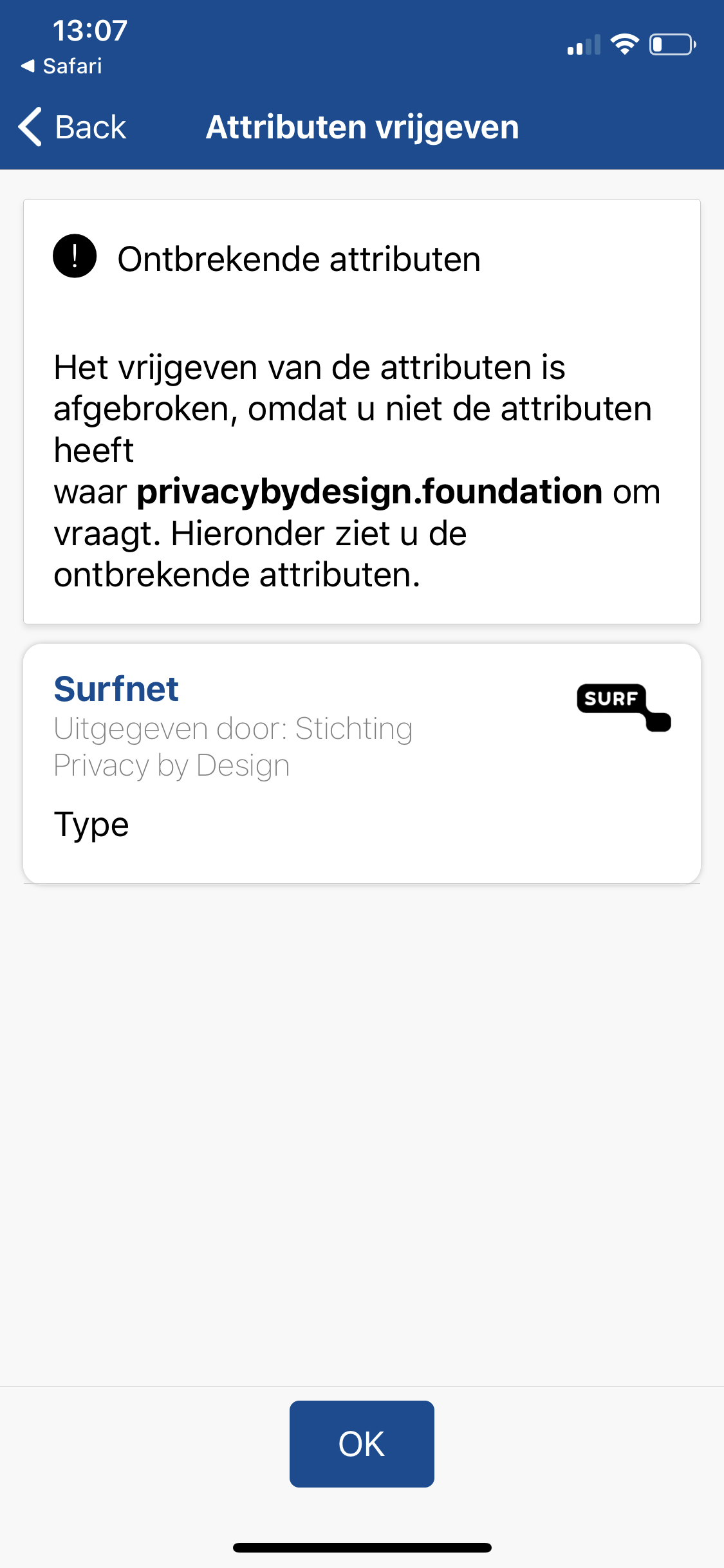
For a new user, it is not necessarily clear what OK means and the word can imply that one just has to accept the fact one does not have the required data. For a user without much experience, this might feel like they cannot do anything to resolve the situation. They might wonder “can I add this missing attribute?" and “how do I obtain it?".
At this stage, the correct course of action is to accept one’s fate, tap “OK”, and manually add the missing attributes (similarly to how attributes are loaded in task 2) and to finally start the disclosure process from scratch again. However, this might not be clear to users. Thus, when it comes to the questions of the CW, we answer question 1 (“Will the user try to achieve the right effect?") with a possible “No”. Of course, some users will try to achieve the right effect, and attempt to load the missing attributes. But some might not understand that this is a possibility and simply give up.
In case a user knows or expects that loading the missing information into IRMA is an option5, they need to find out or remember how to do so. Adding the missing information entails visiting the Privacy by Design Foundation website and then loading attributes from the correct issuer, as described in task 2. An extra challenge is that users will have to remember which attributes were missing and identify the attributes in the list of available attributes. In the demo-website, the text on the website helps the user by stating what information is required are and where to obtain this data. We suggest to advise to other websites to do the same. In addition to mentioning the name of needed attributes, we furthermore suggest displaying the logo that corresponds to the needed attributes. Because logos can often be recognized much more easily and quickly than text, this will help users find the attributes in question when searching through the list of available attributes on the Privacy by Design Foundation website. Applied to this specific demo, it would mean that the demo-website also features the SURF-logo to indicate what is needed.
Surprising PIN screens
Some additional issues we ran into when completing this task is a surprising PIN screen (see screenshot below). This screen popped up before one could load the attributes but that did not pop up when loading attributes in task 2. Such PIN checks are implemented for security reasons and pop up regularly. However, we believe for a novice user, it is not clear why they are asked for their PIN at seemingly random moments. Also, the text on the PIN-screen is not ideal, as it talks about requiring a PIN to use an attribute, whereas one actually is in the process of receiving attributes. Hence, we suggest improving the text of the additional PIN entry screens that show up during IRMA sessions.
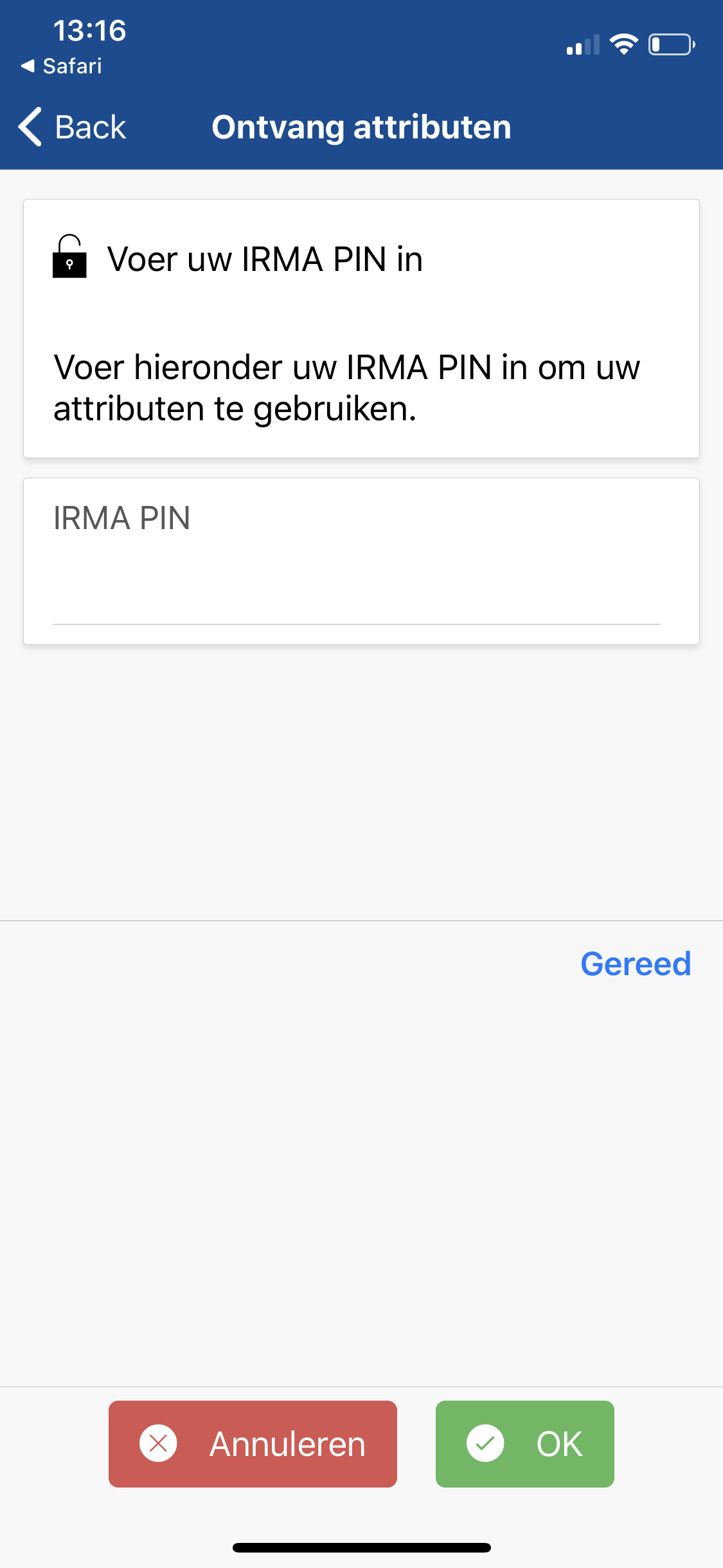
Another little annoyance with this PIN screen is that - unlike in banking apps - there is no indication of the PIN length. As discussed in the onboarding section, a PIN of a set length would be desirable from a UX perspective and would allow the app to guide the user visually, e.g., by providing 5 boxes.
Finally, one can run into a rather annoying problem when completing the entire scenario on an iPhone (rather than on Android or on a desktop computer). After obtaining the missing SURFnet attribute, and subsequently disclosing it to the demo-website, one reaches the home screen (see screenshot below). This is not ideal, as one ideally returns to the website that has requested the information. If one looks closely, the home screen features a tiny little arrow in the top left. Tapping this tiny little link in the top left corner will bring users back to the website where they need to be. This link is very subtle, and in we believe both the first question (“Will the user try to achieve the right effect?") and the second question (“Will the user notice that the correct action is available?") of the CW need to be answered with a “No”. It simply cannot be assumed that users are aware of or will spot this possibility. Unfortunately, this is a known iOS issue and not an IRMA-app issue. Until Apple addresses the issue, we hope the IRMA app can help users notice this tiny arrow and explain that users need to tap this link.
When it comes to the overall experience of obtaining missing attributes during a disclosure session, we believe the user flow could be improved immensely, by offering users the possibility to obtain the missing information during the disclosure session. Ideally, users remain in a flow that leads them to their overall goal (here: revealing their university employment status to a website), and can obtain all required data as part of this flow.
Task 5: Choosing which attributes to disclose during a disclosure session
So far, we have evaluated situations in which a website asks the visitor for specific attributes. A feature of IRMA is that websites can also leave it up to the user which exact attributes they want to disclose. E.g., a website might be interested in the user’s name but accept several sources. We know this form the real world, where one might be asked to prove one’s identity with either a passport, an ID-card, or with a driver license.
IRMA is even more flexible, and a website can, e.g., ask for a combination of data from different sources, or offer the user a choice among various different sets of attributes. We explore such a scenario where the user can choose what to disclose. Concretely, we use the address-verification demo-website from the Privacy by Design Foundation. Here, a user is asked to provide their address, either from the Dutch population register or from iDIN (which means that the address is originally obtained from the user’s bank). We assume the user has loaded the address from both sources and thus has a choice which one to disclose.
The process of choosing what to disclose is incorporated in the disclosure request screen that asks the users to consent to reveal their information (see screenshot below). The fact that users can choose between different options is indicated in 3 ways. First of all, a small text states the number of options among which they can choose. Secondly, a tiny dot indicator illustrates which option is currently selected, and finally, arrows on the sides indicate that users can navigate through different options. This can be done by either tapping the arrows or by swiping the card itself sideways.
When facing the task of choosing what to disclose, we believe users will face little problems on the interaction level, but might not understand the underlying consequences well. E.g., when a user can choose which attributes to disclose, it might not be clear that one only discloses the set that is currently visible. Users might think that “IRMA probably shares everything” or simply not be sure whether only their selection is shared. When it comes to the questions that guide the CW, we believe most questions need to be answered with a “No”. In particular, users might not try to select what data they will share (the user will not try to achieve the right effect). Furthermore, if they want to make a choice, they might not understand that navigating through the different options determines what will be shared (the user will not associate the correct action with the effect they are trying to achieve). Finally, once a user has selected certain attributes, they might not understand that they have made a selection (the user will not see that progress is being made toward the solution of their task).
An interaction design detail we noticed is that the arrows to the left and right remain even when there is no additional card to the left/right. Here, it would make sense to remove the arrow to the left on the first option and the arrow to the right on the last option.
A question that comes to mind at this stage is whether people will understand why they can choose between different sets. The choice in this particular demo can seem rather meaningless at first sight, as one is revealing the exact same address data in either case. Users might wonder “what does it matter, they will receive the same information either way” and doubt on which basis they are supposed to make their choice and if they actually should prefer to share one set of data over the other. However, we believe that because we know similar situations (where various documents with the same information are accepted) from the physical world, this will not be a big problem. Furthermore, we expect that often, the choice will be among different pieces of information. E.g., people might be asked to chose between their physical address and their email address when asked for contact-details. Or they might chose between their home phone number and their work phone number. In such situations, choosing will be easier because the different consequences of the choice are obvious.
We believe that the main issue on this screen, namely clearly communicating that one is only sharing the selected options, can be solved with a tiny adjustment. Instead of always displaying the phrase “2 options” independently of which option is currently selected, the app could display “option 1 selected” and switch to “option 2 selected” when the user changes the selection. (Of course, this would also work similarly for more than 2 options.) We expect that this simple change would already make it much more clear that one is making a choice.

Card actions
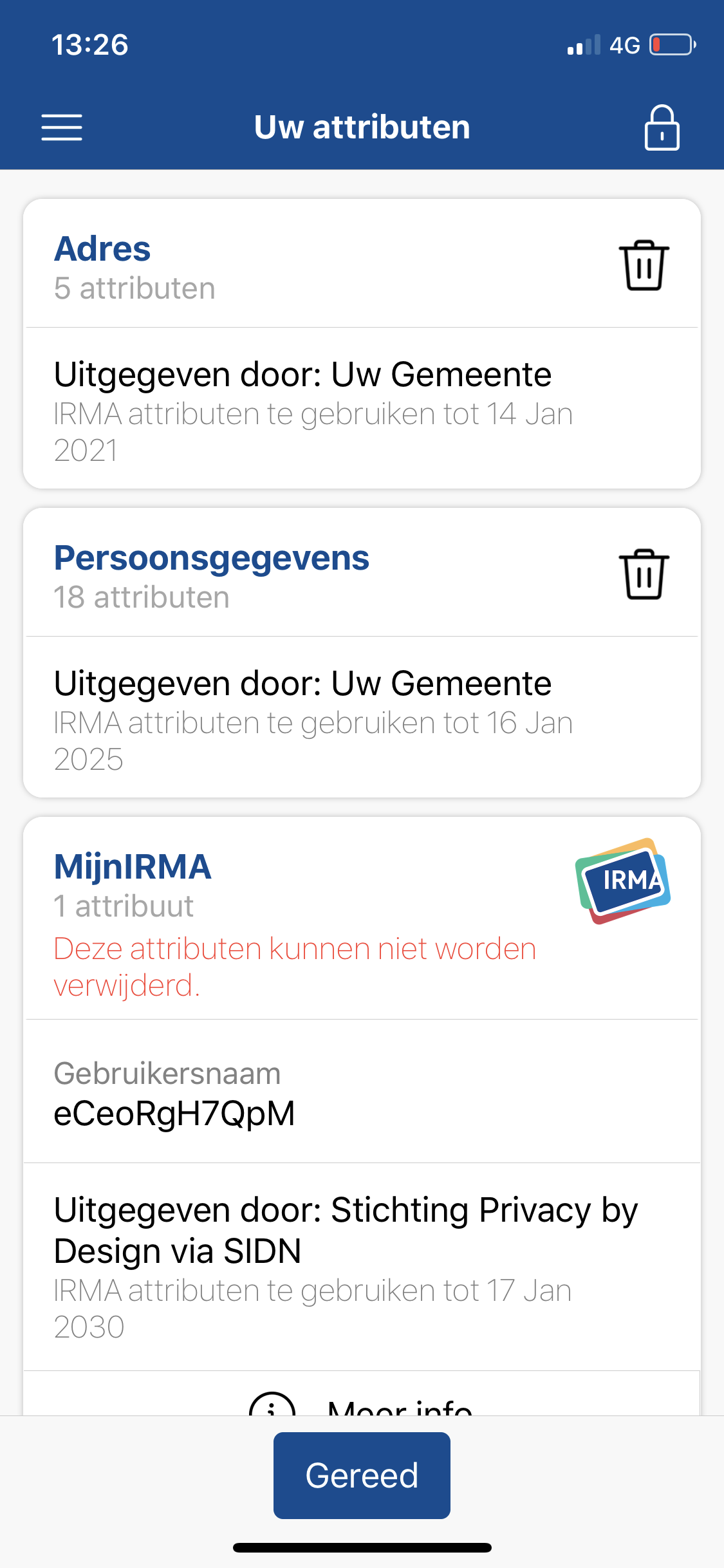
The data that users load into IRMA are visually represented in the form of white cards that are listed on the home screen (see screenshot below). Cards contain one or more attributes that are issued together and that belong together. E.g., all attributes that describe a user’s address are combined on one address card. There are several card actions that either can be performed or that we expect people to attempt to perform. We will go through these actions one by one in the following.
Delete
Cards can be deleted by long-pressing on a card. After a short moment, the logos of all cards (aside from the MijnIRMA card) change to a trashcan icon (see screenshot). Subsequently tapping a trashcan icon then brings up a confirmation dialogue. Once the deletion is confirmed, the card disappears. At this stage, the remaining cards still show the trashcan icons and one can delete more cards. If one wants to exit the deletion-mode, one can press a prominent blue button that is labeled “Gereed” (en: “Done”) on the bottom of the screen.
When asking the CW questions, we answered question 2 (“Will the user notice that the correct action is available?") with a “No”. In other words, some users might want to delete a card, but not be aware that long-pressing is an option. Some users might know the gesture from other applications, but other users might also associate other gestures (e.g., swiping an item to the left) with deletion. A visible card menu could make this option clearer. Also, it could be surprising that a long press on one card puts all cards in a deletion-mode. We believe a user is more likely to attempt to delete one single card rather than several cards in a row. So the concept of entering a general deletion mode that one has to exit by pressing a button might be unnecessarily complex.
Refresh
The data that one loads into IRMA is valid for a given period of time, which is determined by the issuer. (Depending on the type of data, some information stays valid longer than other information). If the data has expired, a user needs to refresh the attributes. We could not test this completely realistically, as our data was not expired. However, we refreshed attributes that still were valid, which works the same way: Refreshing is done by tapping on the card and then selecting the refresh option (nl: *“Verversen” that becomes available on the bottom right of the card (see screenshot below).
What stands out when completing this task is that rather than actually refreshing the card (or the attributes), the refresh option simply means that one is obtaining a new card with fresh attributes that replaces the expired card. In this sense, it is similar to the process described in task 2. This might be slightly confusing for users, and maybe it would be better to invite users to “Get a new card” rather than to refresh their card. In the long term, we hope that refreshing attributes can be made simpler than obtaining them the first time. Possibly, a user could be asked to refresh a card shortly before the expiration date. If the user chooses the refresh option, the card could then be refreshed and the expiration date could be adjusted automatically.
Another small problem we spotted is that the text that indicates the expiration date of the attributes might not be entirely clear. In some cases, users might assume that the original data (e.g., the personal data that is stored at the municipality) is expiring, rather than the data in their IRMA app. We have also heard this from actual users, and thus suggest to consider alternative phrasings.
Correct wrong information
The information one loads into IRMA is static. If one, for instance, loads one address and then moves to another place, information on an IMRA card might be wrong. It hence makes sense that some users might want to correct this information. To do so, one might e.g., try to refresh the card (see above). However, if this does not fix the problem, users are left without any guide whom to contact and what to do. Possibly, if the cards are redesigned, a card menu item could be included that explains to users how to deal with such problems and possibly, even provide them with a link to the issuer, where they can report the outdated information.
Reorder
In theory, users do not actually need to reorder cards to complete any tasks. However, we can imagine that users experience the urge to personalize IRMA to their liking — and changing the order of the cards might be something they would enjoy. Also, users might want to keep cards they find important on top, so they can easily keep an eye on their validity. Currently, this option is not available. We thus suggest to consider it for the future.
Search
Just like reordering, searching through the cards is not really a likely use-case for IRMA. We also do not expect the number of cards that users collect to be so big that this is a much-needed feature in the near future. However, if IRMA develops into a direction where users collect a lot of cards, a search feature might be something to consider.
Task 7: Deleting everything
Ideally, new users are not inclined to delete the IRMA app. However, there is always the possibility that one has no use for the app after all, and intends to delete it. In the following, we evaluate the process of deleting IRMA.
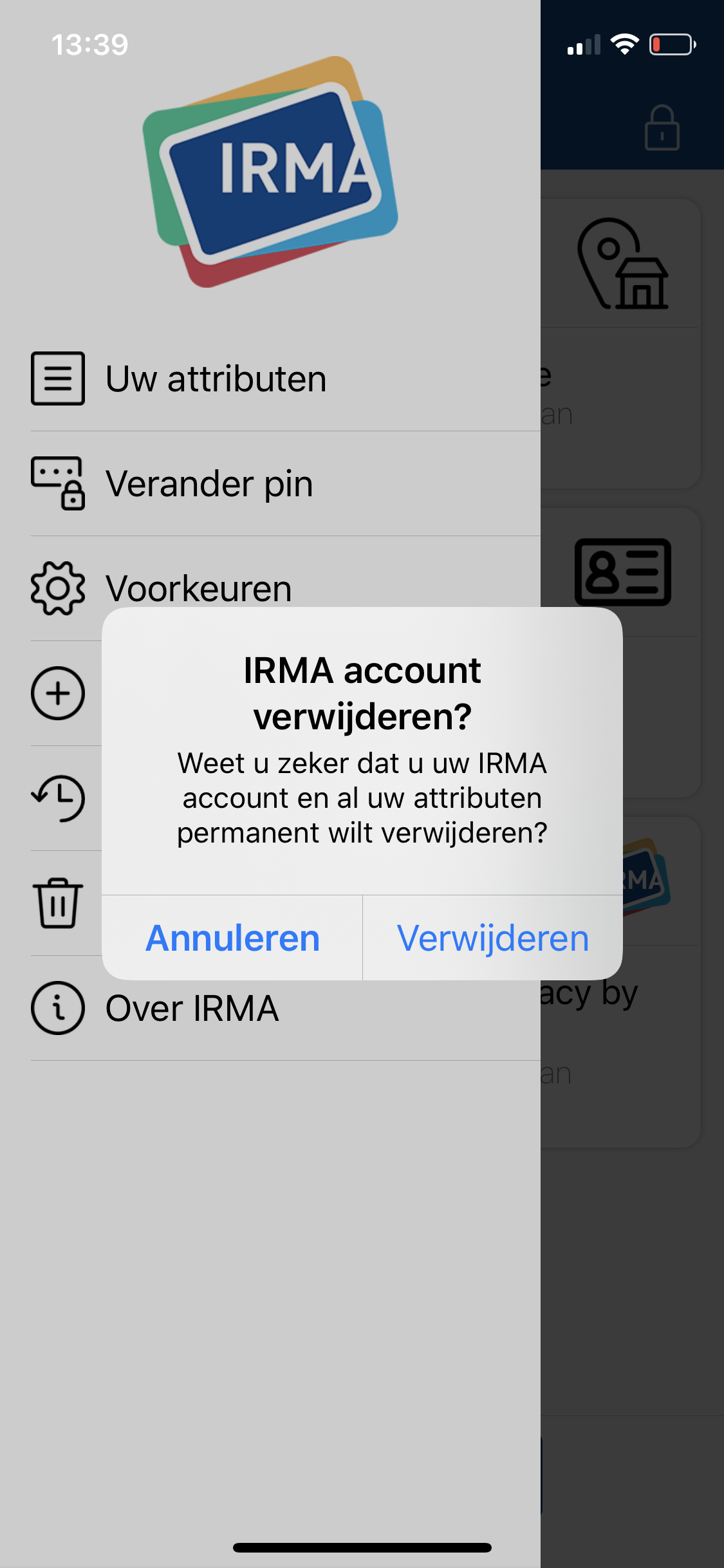
There exist two approaches. Either, one simply deletes the app from one’s phone (for this, one does not even have to open IRMA). In this case, the process depends on the operating system of the phone, and IRMA developers have no influence on how easy or difficult this is. A second option is that users chose the delete option in the menu of the IRMA app. In our opinion, the option is easy to find, and the confirmation dialogue that pops up prevents users from unintended data loss (see screenshot below). We foresee no problems in carrying out the necessary steps. However, also here users might be puzzled by the concept of the IRMA account. For a new user, it likely is still not clear what exactly an IRMA account is, and what consequences deleting the account has. We have recently heard the suggestion to describe this option with “delete everything and start over”. In our opinion that would indeed be a better and simpler description.
Even though it is good that the delete option is easy to find, we think it might be better to move the option to a settings page and not suggest it in the main menu. This way the main menu is not cluttered with items that used very rarely. Likewise, other actions that are not commonly used, such as changing the PIN code, could be moved to the settings page.
Home again
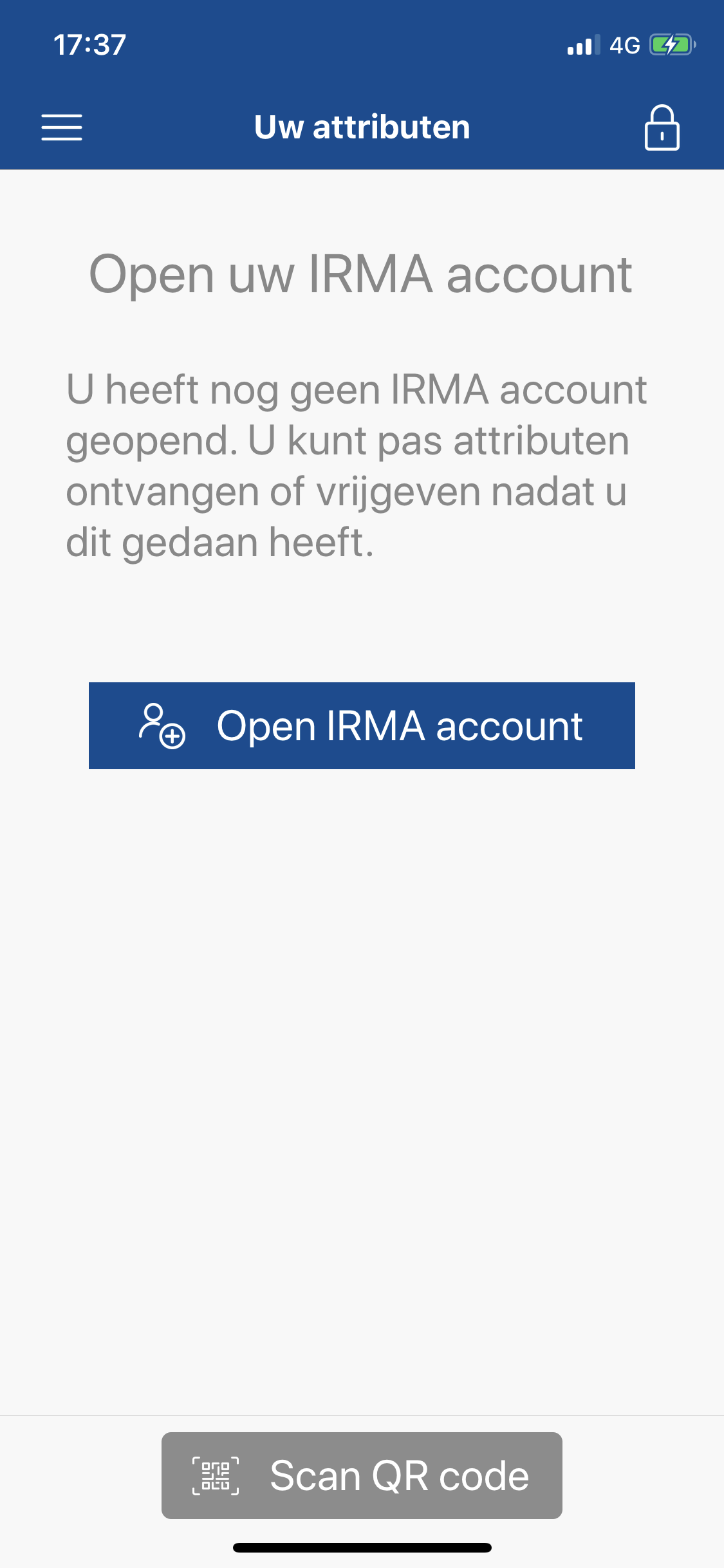
Once a user has deleted their account and attributes, they are presented with the home screen, on which they are urged to open an IRMA account (see screenshot below). In our opinion, it would be better to present them with the initial screen that is also presented when one has freshly installed the IRMA app for the first time. That will ensure the user that everything is “as if they had never used IRMA before”.
Making IRMA easier: top five recommendations
As we have shown, IRMA can be made easier for new users. We have already provided various suggestions on a task by task basis. To guide future developments and improvements, we have prioritized the issues and decided upon five more general heuristics that, in our opinion, will have the greatest impact on the user experience.
1. Keep users in the app as much as possible
As mentioned, we suggest listing the attributes that people can obtain in the IRMA app itself, rather than having users navigate to the Privacy by Design Foundation website to retrieve attributes. Obtaining attributes requires users to visit the website of the issuer, and possibly even open other apps. As switching between apps and websites can already be difficult for users, we advise to keep users in the IRMA app as much and long as possible and to offer as many IRMA-related services right from within the app.
2. Help users to resolve problems
One of the most frustrating moments when using IRMA currently is when one is asked to disclose information that one does not have loaded into the IRMA app yet. Here, users are simply informed about the problem. Including an option to fix the problem, and thus directly load the missing attribute into IRMA would improve the IRMA user experience considerably. More general, users should be allowed to complete their goals in one flow, without the need to abort the process, solve issues, and start anew. Simply put, instead of informing users about problems, IRMA should help users resolve problems.
3. Invite users to load data into IRMA
Currently, after completing the onboarding, users are not ready to make use of IRMA yet. They still have to load personal information into the app. We believe it will be helpful to nudge users to immediately load useful data, such as the personal data from the Dutch population register. Immediately loading data into IRMA will prepare users for the future, but also help them form a better mental model of what the app is and does.
4. Foster understanding
The fact that a user is able to carry out tasks does not necessarily mean that the user also understands what is going on. In our opinion, IMRA can be made much easier by improving the terminology (and most importantly find a better term for “attributes”) and texts. Also, with respect to texts, less is more. We noticed that the app uses quite long texts and suggest to shorten them. Furthermore, the app currently contains quite some technical terms. E.g., a screen that pops up regularly is informing users that the app is “communicating with server”. Words like “server” might frighten some users. Finally, a help screen with explanations could help users better understand the concept behind IRMA as well as illustrate how to complete common tasks in IRMA.
5. Help users make deliberate choices about what information they share
Understanding what is going on is particularly important when users are asked to share information with a third party. IRMA puts users in control of their own data, and one main goal is that IRMA allows users to share as little personal information as possible. This only works when users understand the disclosure requests and make deliberate decisions. Ideally, users will not agree to unjustified requests. The questions of whether people can determine if requests are justified and how to design for deliberate decisions could be entire projects in itself. For instance, future work could explore whether color-coding the sensitivity of the data one is sharing (e.g., coloring the BSN number red and non-identifiable information such as “above 18” green) would help people make better data-sharing decisions. Likewise, one could explore the option to report unjustified requests. Also, one could include the reason why information is requested or how the information will be used in the disclosure scree. All of these choices likely affect how users experience the data-disclosure process.
A concrete first concrete step for helping people make deliberate decisions would be to improve the disclosure screen when peoples have a choice about what data they share. Here, the fact that users are able to select what they want to share might not be clear to all users yet and tiny changes in the interface (see above) might help a lot.
Conclusion
We have conducted a cognitive walkthrough to evaluate the usability of the IRMA app. This has revealed several potential problems. We have also made various suggestions about how to improve the usability and user experience of IRMA. Usually, the logical next step would be to address the identified issues, implement the recommendations, and thus improve the app. Subsequently, testing with users would be a good step to identify additional issues. This was also our original plan about how to proceed. However, the IRMA development has recently taken some surprising turns and a new and completely overhauled version of the IRMA app is in the works. Hence, rather than addressing the identified issues in the current app, the presented recommendations and suggestions are used as a guideline in the development of the new app. We are closely involved in this process and the insights gained in this evaluation serve us well. For instance, we are checking mockups and prototypes against our findings to ensure that the new app learns from the pitfalls of the old app and fixes the identified problems. Yet, we should not forget that many aspects of IRMA are already very clear. Hence, in the redesigning of IRMA, we are also keeping an eye open to make sure the IRMA app is not losing its core qualities and to ensure that elements that work well are not thrown overboard. Even though the title of this NLnet project is “IRMA made easy”, our expert evaluation reveals that this project is not so much about making IRMA easy, but rather, about making IRMA easier.
-
Much of our description is based on the Wikipedia article on cognitive walkthroughs an the following paper: Wharton, C., Rieman, J., Lewis, C. & Polson, P. (1994). The Cognitive Walkthrough: A practitioner’s guide. In J. Nielsen & R. L. Mack (Eds.), Usability inspections methods (pp. 105-140). New York: Wiley. Both the paper and the Wikipedia article are excellent resources to learn more about the cognitive walkthrough method. ↩︎
-
Sometimes, the process is reduced to use fewer questions, and quite some variations of the questions exist. ↩︎
-
During the onboarding, users are asked to share their e-mail address with the Privacy by Design Foundation and link it to their IRMA app. The email address is required to make sure users can block their IRMA app in case they lose their phone. Providing the email address is completely voluntary but advised. ↩︎
-
In the meantime, we received an interesting idea about how to improve the screen further from the Amsterdam UX team. Their designers suggest to include the reason why the information is requested/necessary. So far, we expected this reason to be shown on the website itself rather than in IRMA. But adding it to IRMA might be an interesting addition to explore. ↩︎
-
Strictly speaking, adding the necessary information is not always an option. E.g., a user might attempt to disclose that they are above 18 when in reality they are younger. Similarly, someone might attempt to prove they are a student when they are not. In such cases, the user cannot obtain the necessary information. In this scenario, we assume that a user attempts to disclose information that they have not loaded into IRMA yet, but that they can actually load into IRMA. ↩︎