If you can read this text, it means that the contrast between the text and its background is big enough for you to distinguish the foreground from the background. However, this does not necessarily mean that the contrast is also sufficient for others. When developing the IRMA app, we quickly learned that when it comes to accessibility (a11y) we cannot simply trust our own eyes. Instead, to ensure the app is legible also for people with weaker visual acuity, we followed widely accepted contrast guidelines. For most elements, we (the team involved in the design and development of the app) immediately got it right. However, as a recent accessibility audit by Stichting Accessibility showed, there were a few contrast issues that we had overlooked. In this blog post, we summarize our process around getting contrasts right. We discuss what guidelines to follow, how to check whether a design meets these guidelines, and how to automatically check for contrast issues when developing Flutter apps by writing widget tests. We expect readers of this post to be familiar with the basics of Flutter and to know the IRMA app – but you probably can also get the gist of it if both are new to you.
What is a good contrast?
When considering the legibility of any kind of digital design, it is tempting to rely on one’s own experience. However, by doing so, one easily creates designs that are difficult to use by visually impaired users. Luckily there is a widely accepted guideline that helps developers and designers to design in an inclusive and accessible manner. The guideline I am talking about is part of the Web Content Accessibility Guidelines (WCAG) 2.1, namely guideline 1.4, which focuses on ensuring the information in the foreground is easily distinguishable from the background, or in other words, helps you make the information you want to convey easy to perceive for people with disabilities. While many guidelines focus on presenting alternative content to users with disabilities (e.g. by reading text out loud), this guideline concerns the default interface. It helps you pick good contrasts so that both people without visual impairments and people with visual impairments can enjoy the same interface. To achieve that, an interface should meet several criteria. When, e.g., using color to convey information, the information also should be presented in an additional way, so people who have difficulties with discerning the color still have access to the information. (In addition to, for instance, marking an error in red, one could also display an error-icon). Another aspect of making the interface work well for all kinds of users is ensuring a minimum contrast between foreground and background elements. This minimum contrast is the focus of this blog post.
Guideline 1.4 of the Web Content Accessibility Guidelines (WCAG) 2.1, defines important contrast-ratios that you can follow. At this, it distinguishes between two levels of conformance: AA and AAA, with AAA being harder to meet and thus requiring a bigger contrast. This might seem a bit abstract at first. As the WCAG website explains, the AA level requires a contrast that is still big enough for users with 20/40 vision (people who have 20/40 vision are slightly nearsighted, and can see things at 20 feet that others can already see at 40 feet). This is an acuity considered typical for users who are about 80 years old. The AAA level, in contrast, goes further and requires a contrast that is also sufficient for users with 20/80 vision, putting their eyesight in the low vision range.
For both levels, exact contrast ratios are defined for normal text and large text. For the IRMA app, we aim for compliance with at least level AA, resulting in the following minimum contrast-ratio requirements:
- 4.5:1 for normal text
- 3.0:1 for large text (at least 18 point or 14 point bold)
Knowing what to check for leaves us with the questions of when to check, and how to check.
When to check if the guideline is met?
In our opinion, it is important to check visual design choices as soon as possible. This is because a visual design does not consist of independent elements that can be changed and fixed later on individually. Rather, a well-balanced visual design depends on the interplay between elements. This means that having to change one aspect might cause a whole chain of changes. E.g., if the color of the background is poorly chosen and fixed later on, it might be necessary to also change the colors used for buttons or headlines to maintain a balanced overall look and feel. To prevent large redesigns, one ideally checks at every step along the way. Also, by checking the design early on, one can be certain that the final design is made by (or in close collaboration with) the designer, rather than by a developer who tweaks the look and feel according to accessibility guidelines later on — potentially leading to an accessible, but not necessarily aesthetically pleasing visual result. Having said that, it certainly cannot hurt to also check the design during and after the development process. This way, one might not only catch contrast issues that have been overlooked but also catch instances where the design has not been implemented according to the original specification.
When developing the IRMA app, we followed the approach of testing each visual design decision as early as possible. As soon as visual designs were proposed, both the designer from the Amsterdam team and the NLnet team checked for potential problems (several pairs of eyes literally see more than one!). But how do you check?
How to check if the guideline is met?
The answer to this question probably will not surprise you. These days, there is an app for almost everything — and there is also an app to check for contrast issues. In fact, there are plenty of apps, applications, and web-based tools for checking contrast. When developing IRMA, we used two of them: First, the website WebAIM (web accessibility in mind) and second, the desktop application Colour Contrast Analyser from the Paciello Group. Both tools contain a convenient color picker to select different colors and asses their contrast. Which one to use simply came down to a matter of personal taste.
The audit by Stichting Accessibility
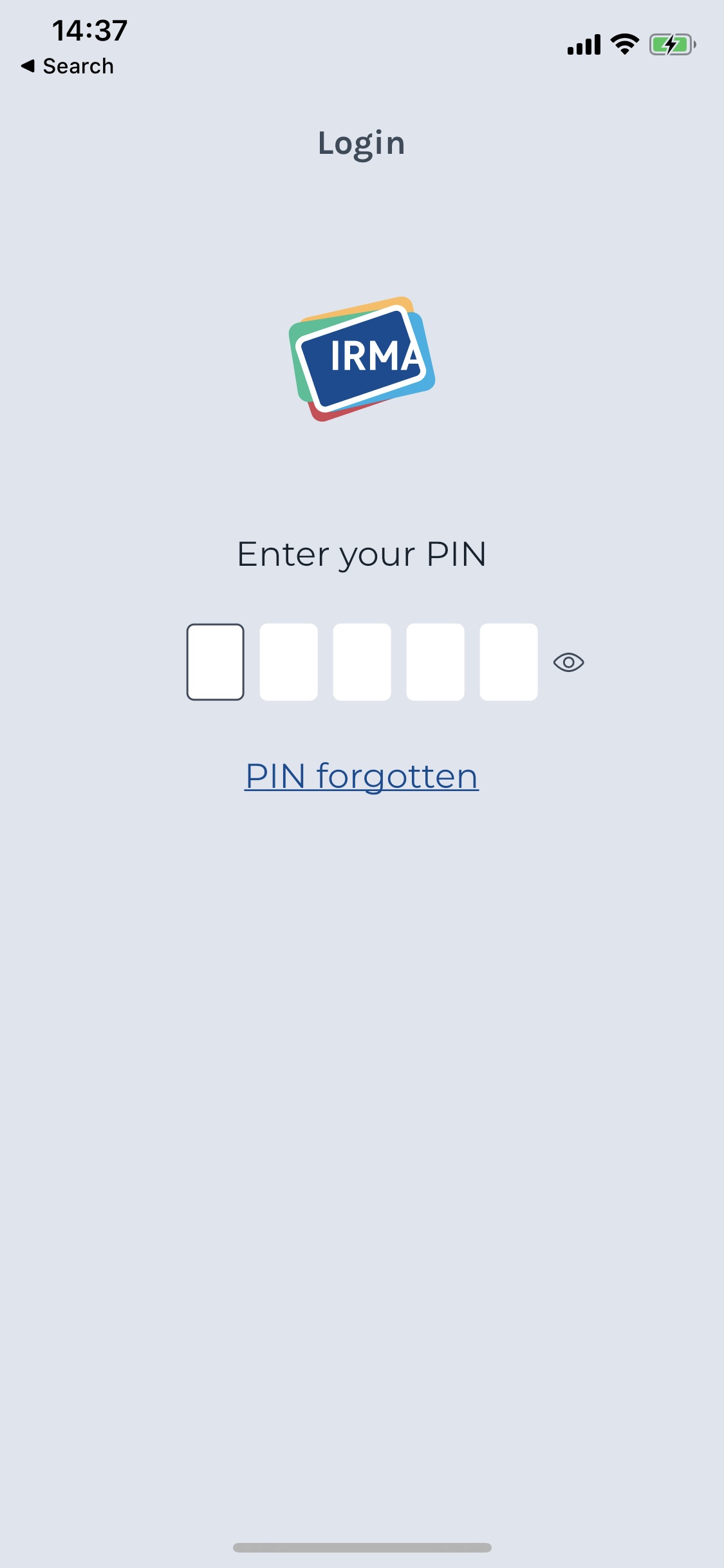
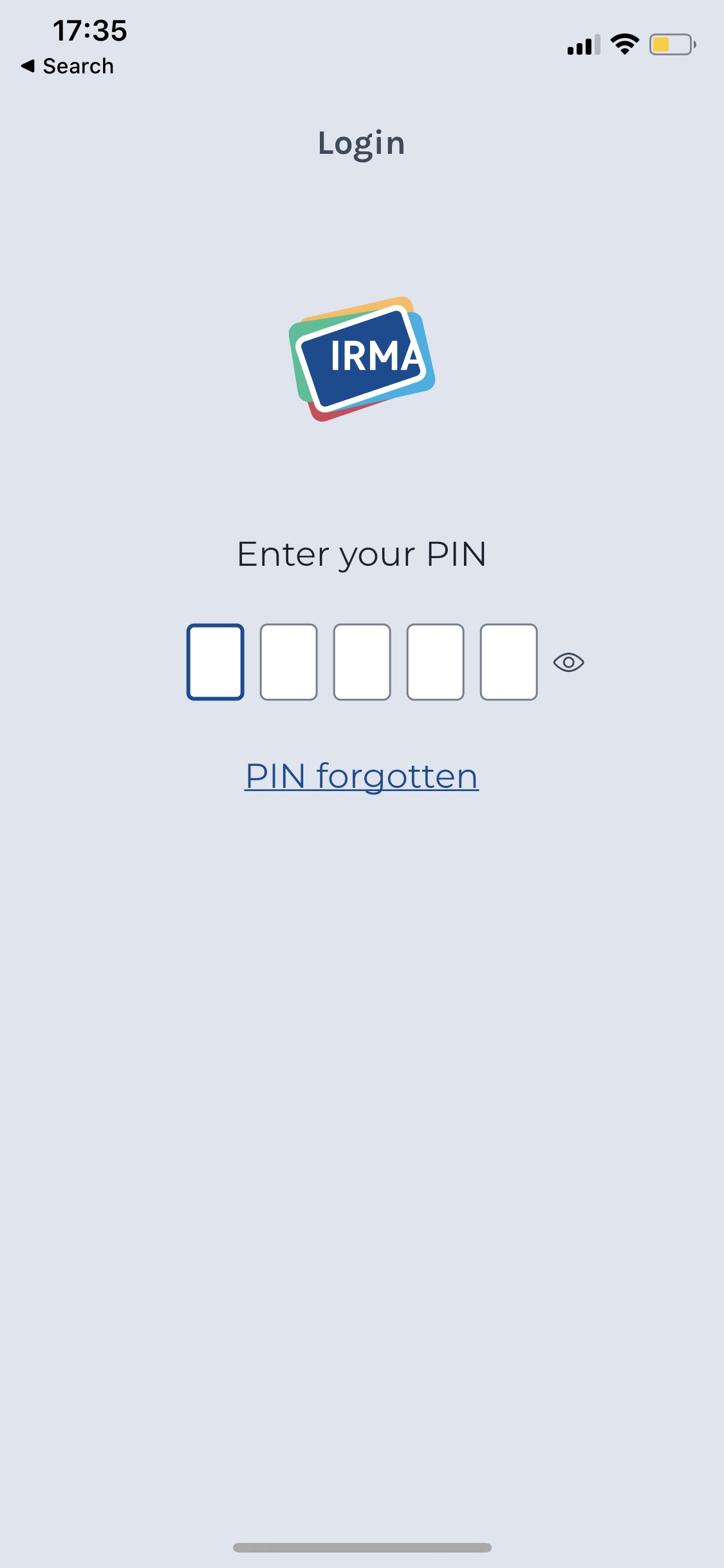
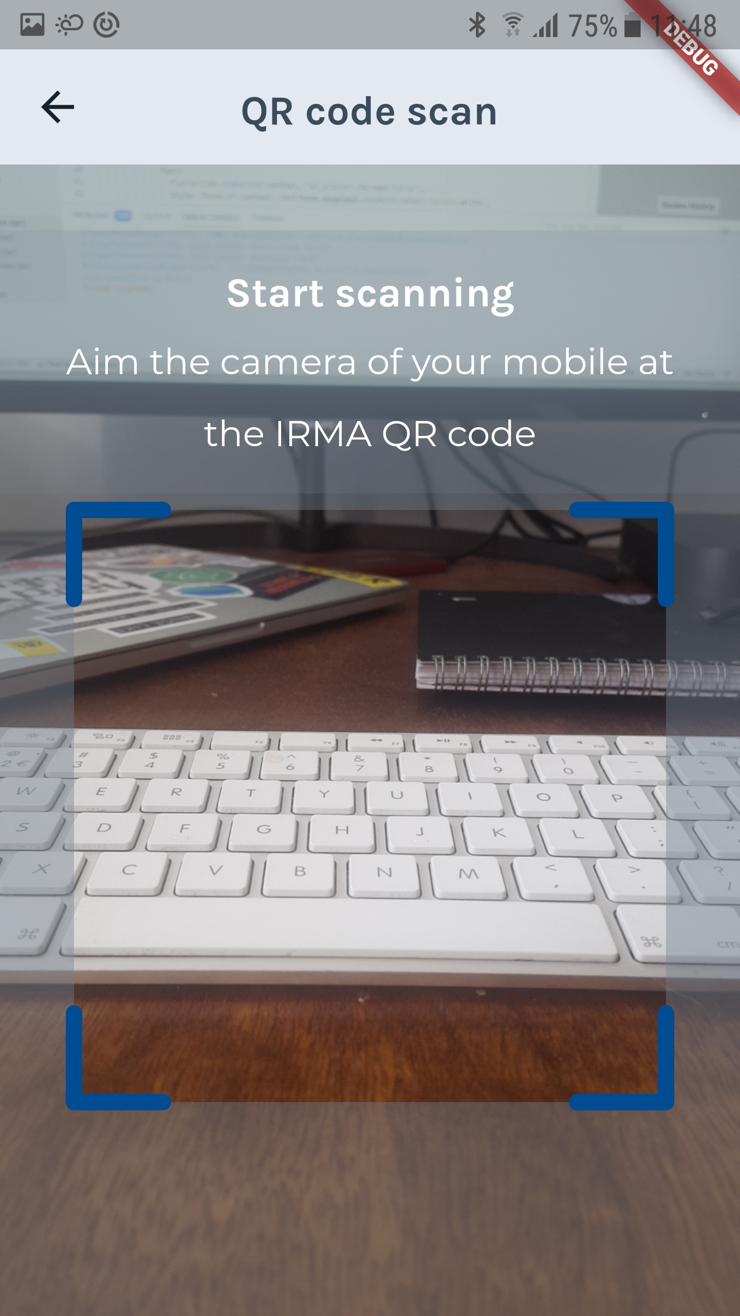
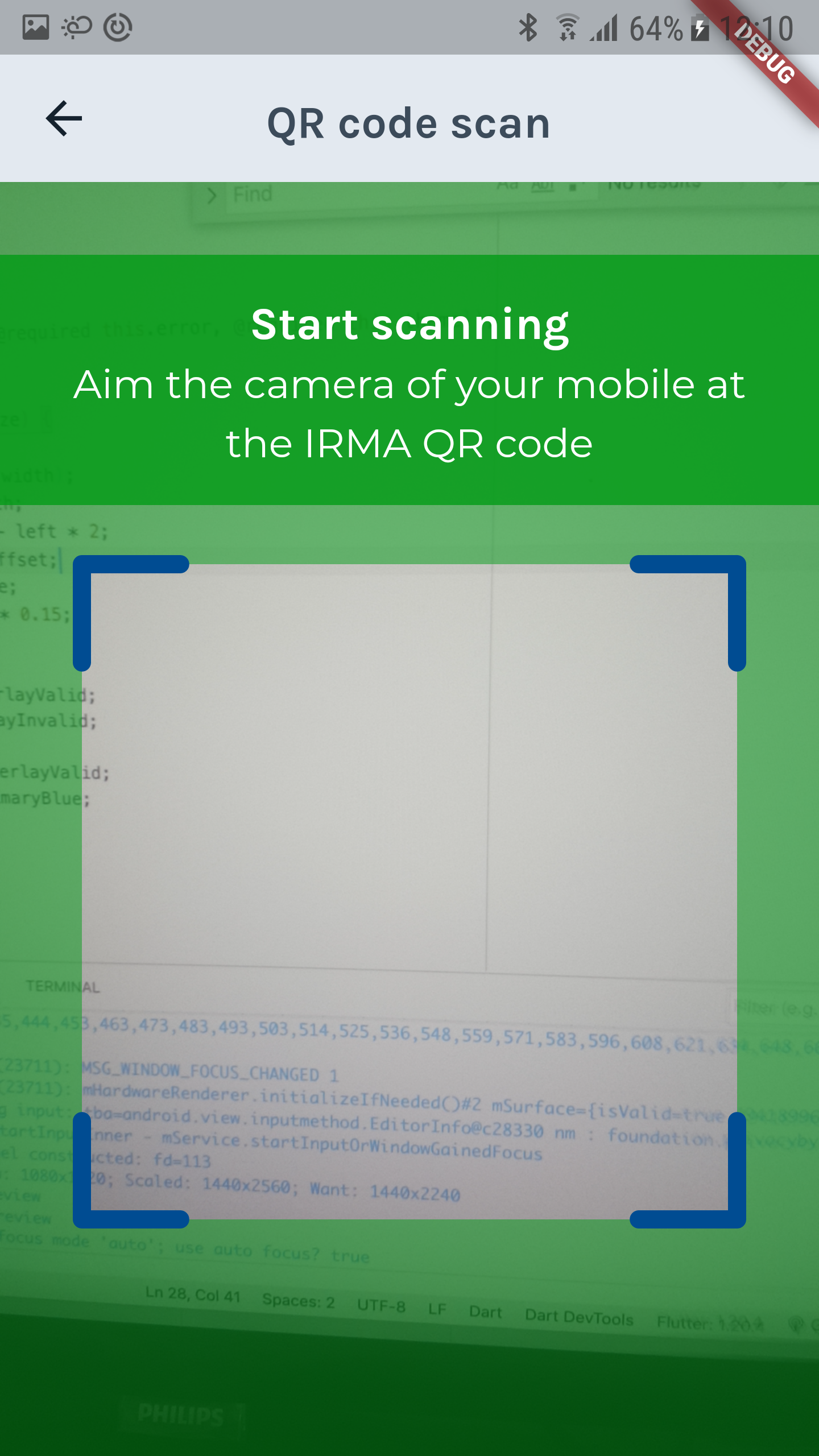
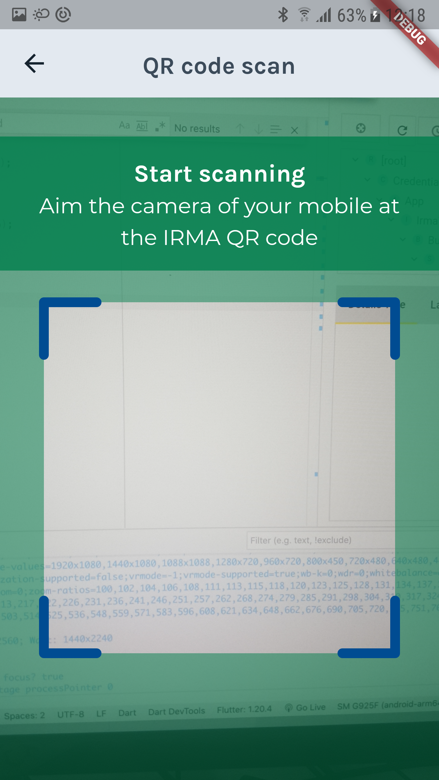
Although we did our very best to check for contrast issues (as well as other a11y issues) as soon as possible with the above-mentioned tools, we did not catch everything. Luckily, the audit by Stichting Accessibility (have a look at our previous blog post for details and background information!) also checked for contrast issues and caught two remaining issues. Most importantly, they alerted us to a contrast issue on the login screen that prompts users to fill in their PIN code. The white boxes that hold the individual digits of the PIN have little contrast with the light grayish background, and users with visual impairments might hardly notice them. Furthermore, Stichting Accessibility noticed the poor contrast on the QR scan screen, which uses white text on a gray semi-transparent background. You can see both issues and how we fixed them in the screenshots in the next section.
Fixing the contrast issues
To fix the issues, we went back to the original design team and asked for advice. We were glad to hear from the Amsterdam-team (and in particular Mike Alders) immediately, who made a new mock-up of an improved login screen for us (thank you, Mike!). This redesign introduced extra borders around the PIN fields to set them more clearly apart from the rest. You can see the original screens fixed screen below — it is already merged and part of the current beta version of the IRMA app (see Android Beta and iOS Beta).
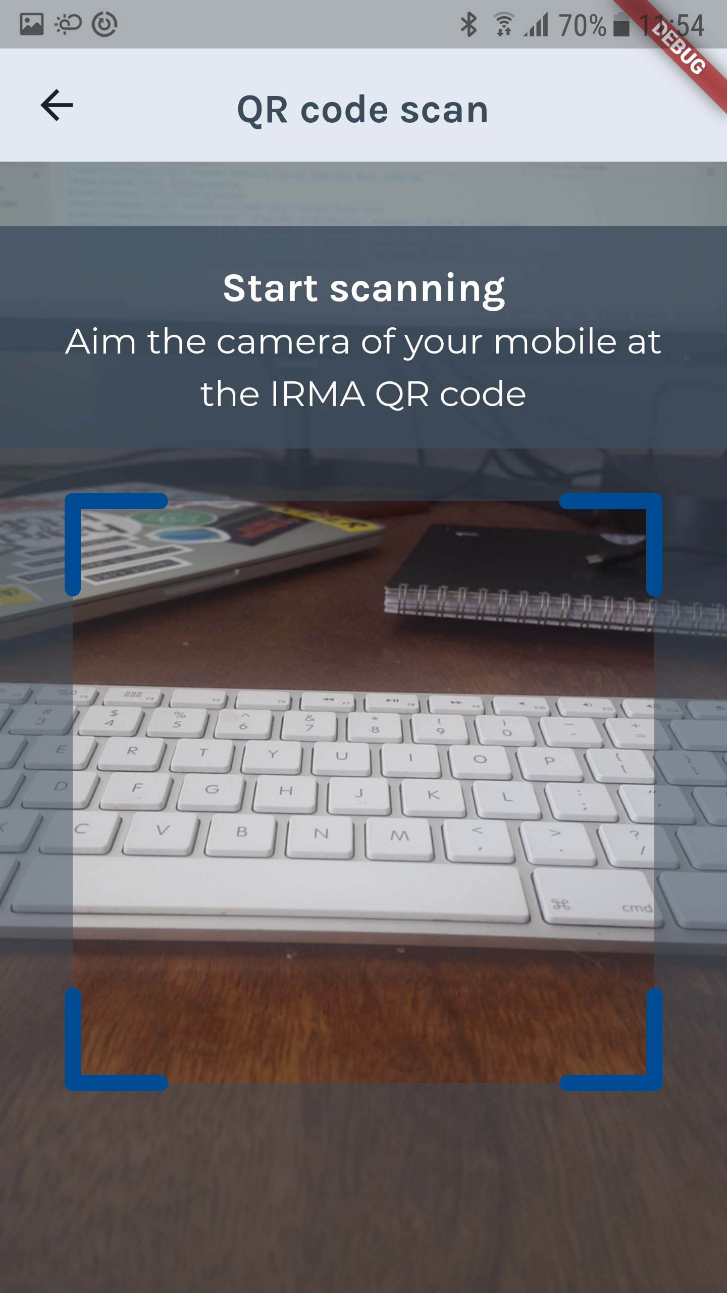
For the QR code screen, the fix was even more simple: because we wanted to keep the text white, the backgrounds needed to be darker, ultimately resulting in less transparent backgrounds, and a darker shade of gray:
Because the audit alerted us to issues on the gray QR code scan screen, we checked the other QR scan screens as well (a green screen for successful scans and a red screen when an invalid QR code is detected). We noticed that the same problem occurs for green screens. With a different shade of green, this problem was also easily fixed.
Using Flutter widget tests to assert WCAG criteria
In the end, fixing the identified contrast issues was not a problem, and only affected a few lines of code. The real challenge was finding the issues in the first place. Even though we did our best to find those errors in advance, some issues had escaped our thorough reviews and were only found thanks to the external audit. Could we have avoided these issues by using some other process or tool? How can we make sure we will do even better in the future? Since developing the initial version of the app, we gained additional experience with Flutter and have learned that there is a way to check for contrast that could have helped us spot these issues: Testing for contrast issues with Flutter widget tests. Writing such tests is easy, and we generally recommend it to Flutter developers.
A Flutter widget test is a means to test your user interface and the various elements in it. Flutter widget tests are often used to check whether all elements are shown on the screen, and to test whether interactions with widgets have the intended result.
Explaining widget testing itself goes beyond the scope of this blog post. But if you are interested, a great introduction is provided by the Flutter team on the flutter.dev website, in the article "An introduction to widget testing". What is not mentioned in this article, and what often goes unnoticed, is that you can also use widget tests to check whether your interface adheres to the WCAG contrast guidelines. In the following, we show you how you can do this, with an extremely simple Flutter app that violates the WCAG contrasts on purpose, so we can show you how to use widget tests to notice that.
An app that does it wrong
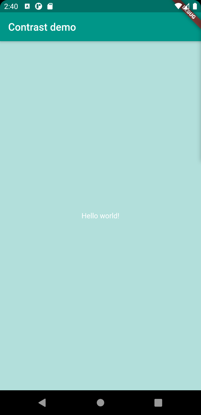
For demonstration purposes, we generate a new default Flutter project called “hello_world”, delete all the code we do not need, and make some small adjustments. To ensure the contrast is problematic, we place a white text (Hello world!) on a light-teal background.
The resulting code of our app:
import 'package:flutter/material.dart';

void main() {
  runApp(MyApp());
}

class MyApp extends StatelessWidget {
  @override
  Widget build(BuildContext context) {
    return MaterialApp(
      title: 'Contrast demo',
      theme: ThemeData(
        primarySwatch: Colors.teal,
        visualDensity: VisualDensity.adaptivePlatformDensity,
      ),
      home: Scaffold(
        appBar: AppBar(
          title: Text("Contrast demo"),
        ),
        backgroundColor: Colors.teal.shade100,
        body: Center(
          child: Text(
            'Hello world!',
            style: TextStyle(color: Colors.white),
          ),
        ),
      ),
    );
  }
}
The corresponding app looks like this, and as you might already see, the contrast between the white font and the rather bright background is not ideal.
Let’s pretend we did not notice the poor contrast, and let’s write a widget test that will alert us to this issue.
The widget test
When you create a default Flutter project, the project also comes with a basic widget test in the test folder. The test is defined using the testWidgets() function provided by the flutter_test package. We can use the test that is included automatically with new projects as a point of departure, but we have to change a few things for it to work with our app.
First, we change the description of the test to fit our purpose and remove the existing test code. The code that remains does not test anything yet, but it provides a good basis for adding our intended contrast test. To make things clearer, I have copied a few comments from the flutter.dev website that explains what is going on in the code. The result is the following:
import 'package:flutter_test/flutter_test.dart';
import 'package:hello_world/main.dart';

void main() {
  // Define a test. The TestWidgets function also provides a WidgetTester
  // to work with. The WidgetTester allows you to build and interact
  // with widgets in the test environment.
  testWidgets('Text contrast test', (WidgetTester tester) async {
    // Test code goes here.
  });
}
We are ready to check the contrasts. For this, the flutter_test package provides the meetsGuideline() function. This function tests whether the currently rendered widget meets a provided accessibility guideline. You can provide several guidelines. We are interested in the textContrastGuideline, which corresponds with the WCAG guideline for level AA compliance we described above. More specifically, as stated in the official documentation, the textContrastGuideline performs the following check:
This guideline traverses the semantics tree looking for nodes with values or labels that corresponds to a Text or Editable text widget. Given the background pixels for the area around this widget, it performs a very naive partitioning of the colors into “light” and “dark” and then chooses the most frequently occurring color in each partition as a representative of the foreground and background colors. The contrast ratio is calculated from these colors according to the WCAG. (Source: https://api.flutter.dev/)
If you have not worked with a11y in Flutter before, the idea of a semantics tree might be new to you. Didier Boelens perfectly summarizes this concept on his Flutter blog:
When Flutter renders the Widgets tree, it also maintains a second tree, called Semantics Tree which is used by the Mobile Device assistive technology (Android TalkBack or iOS VoiceOver).
Each node of this Semantics tree is a SemanticsNode which might correspond to one or to a group of Widgets.
When you use a Text widget, a node is automatically inserted into the Semantics tree, holding the text of your Text widget. This means, that when running the meetsGuideline() function with the textContrastGuideline, it should find our “Hello World!" text in the semantics tree and check its color against its background. It is exactly the test we need to catch contrast issues during the development phase!
To use this test, we can simply copy and paste the example provided in the meetsGuideline documentation into our code. From the documentation of this function, we learn that the meetsGuideline matcher requires semantics to be enabled first and that the result needs to be awaited. If we integrate the example from the documentation in our code, we get the following test:
import 'package:flutter_test/flutter_test.dart';
import 'package:hello_world/main.dart';

void main() {
  // Define a test. The TestWidgets function also provides a WidgetTester
  // to work with. The WidgetTester allows you to build and interact
  // with widgets in the test environment.
  testWidgets('Text contrast test', (WidgetTester tester) async {
    // Build the MyApp widget with the WidgetTester
    await tester.pumpWidget(MyApp());

    // Check the contrast
    final SemanticsHandle handle = tester.ensureSemantics();
    await expectLater(tester, meetsGuideline(textContrastGuideline));
    handle.dispose();
  });
}
If we run this test, it fails and we get a wonderful exception. It tells us what the problem is, reports the exact contrast ratio, and even points us to additional information:
Exception has occurred.
TestFailure (Expected: Text contrast should follow WCAG guidelines
  Actual: <Instance of 'WidgetTester'>
   Which: SemanticsNode#4(Rect.fromLTRB(316.0, 321.0, 484.0, 335.0), label: "Hello world!", textDirection: ltr):
          Expected contrast ratio of at least 4.5 but found 1.45 for a font size of 14.0. The computed light color was: Color(0xffffffff), The computed dark color was: Color(0xffb2dfdb)
          See also: https://www.w3.org/TR/UNDERSTANDING-WCAG20/visual-audio-contrast-contrast.html
)
If we check the same design by comparing the background and foreground with the WebAIM tool, we get almost exactly the same result: a contrast ratio of 1.46:1 (rather than the 1.45:1 reported by Flutter).
To demonstrate that the same test succeeds with better contrast, we can change the text to black (by removing the style from the Text widget), and run the test again. Unsurprisingly, with this rather big contrast, the test now succeeds.
Test what you want to test
Because we initially had a failing test complaining about the text’s contrast, we can be quite certain that we have tested exactly what we wanted to test. However, when a test simply succeeds, one should probably not blindly trust that one has tested what one intended to test. First of all, it is always possible to make a mistake and build the wrong widget with the WidgetTester. Also, because the textContrastGuideline traverses the semantics tree looking for text, a test might succeed even with poor contrast if a text was (accidentally) excluded from the semantics tree. In other words, a test might succeed because Flutter has not looked at all the elements you expected it to look at. Hence, the test can be improved by first ensuring that all elements you expect to be part of the Widget are actually found and considered in the test. To test more thoroughly, and check whether we are actually testing what we want to test, we can first assert that the widget we are testing (here MyApp()) and the corresponding semantics tree actually contain the text Hello world!. To verify this, we carry out the following steps:
- Search for our Text widget using a Finder
- Verify the Text widget using a Matcher
These key ingredients are generally used when writing widget tests and it is good to memorize them. In our case, the resulting code looks like this:
import 'package:flutter_test/flutter_test.dart';
import 'package:hello_world/main.dart';

void main() {
  // Define a test. The TestWidgets function also provides a WidgetTester
  // to work with. The WidgetTester allows you to build and interact
  // with widgets in the test environment.
  testWidgets('Text contrast test', (WidgetTester tester) async {
    // Build the MyApp widget with the WidgetTester
    await tester.pumpWidget(MyApp());

    // Search for our Text widget using a Finder
    final textFinder = find.bySemanticsLabel('Hello world!');

    // Verify that the Text widget appears exactly once in the widget tree
    expect(textFinder, findsOneWidget);

    // Check the contrast
    final SemanticsHandle handle = tester.ensureSemantics();
    await expectLater(tester, meetsGuideline(textContrastGuideline));
    handle.dispose();
  });
}
If this test succeeds, we know that an element with the semantics label “Hello world!" is part of the widget tree, and because it is found on the basis of its semantics label, also certainly part of the semantics tree. It is thus part of what is checked when the textContrastGuideline traverses the semantics tree. Simply put, we now know Flutter has looked at the text before concluding the contrast with its background suffices.
If you run the test with black text on light background, it should succeed. I recommend also changing the text 'Hello world!' to something else so, you can see the test fail because the semantics label you are looking for is not found.
Does widget testing suffice?
With Flutter handling the contrasts checks so well and providing excellent information, you might wonder whether widget testing on its own suffices. In our opinion, the answer is no. As we discussed above, testing the design as early as possible is important to prevent bigger changes later on. Because Flutter widget tests only spot problems at the implementation stage rather than at the design stage, we believe they should be used in addition to the tests that the designers carry out themselves.
What is more, testing in software development always has its own issues. Can you, for instance, really trust the test tool? In the case of the Flutter tests that we have been running, wrong results have been reported in specific cases in the GitHub issue When Testing Accessibility, Text Contrast Tests Do Not Always Give Right Results. This also emphasizes that blindly relying on technology to find problems for us is not an option.
Summary and conclusion
When designing and developing mobile applications, one has to consciously consider whether the contrast between the foreground and the background is big enough. To ensure sufficient contrast, the WCAG guideline 1.4 provides concrete minimum contrast ratios. Many digital tools allow designers to check their designs for contrast issues. We recommend checking the contrast as early as possible, to prevent problematic implementations and bigger changes later on. Nonetheless, some issues might escape the teams’ eye. This also happened to us. To catch such problems when building Flutter apps, widget testing can be used. The flutter_test package provides valuable tools, which make this simple and effortless. In our opinion, with great tools available for both designers and developers, getting contrasts right is truly a shared responsibility — and it is also a responsibility we want to live up to both with the IRMA app as well as with the apps we develop at iHub’s design and development lab at Radboud University.