The identity-management app IRMA is designed as a digital wallet that holds a user’s personal information in the form of virtual cards. These cards can contain all kinds of details, such as a user’s name, address, age, email address, mobile number and more. Users obtain these cards from trusted sources, such as the municipality of Nijmegen, which issues the information from the Dutch Personal Records Database to everyone living in the Netherlands.
Once users have collected IRMA cards, they can use them to authenticate themselves at other parties. For instance, Amsterdam is planning to allow citizens to log in to their online platform with IRMA (for a Dutch announcement, see IRMA: nieuwe manier van inloggen ).
Using IRMA has many advantages, especially when it comes to privacy. One key benefit for end-users is that they can disclose only relevant information while keeping all irrelevant information private. For instance, users would only show that they are above 16 and nothing else to access an age-restricted game. In addition to being privacy-friendly, IRMA also has become much more user-friendly with the UX redesign it received in 2020. However, the app still has some usability issues that need to be addressed to make using IRMA even more easy. In this blog post, we address one of the most pressing remaining issues: namely, the complexity of loading all the cards one needs into IRMA.
Getting started with IRMA
All IRMA users face one universal challenge: they need to fill the IRMA app with cards to use IRMA. Unfortunately, what cards to load and how to obtain them differs from use case to use case. Depending on where users want to use IRMA, they need to obtain different cards. To mention just a few examples: To use the video-call service irma-meet, users have to obtain an email address card and either the personal data card offered by the municipality of Nijmegen or a card with their LinkedIn name. To try out the IRMAtube demo, users need to obtain the IRMAtube membership card. And to use the full version of the personal health environment by Ivido, users need to obtain both the personal data card from the municipality of Nijmegen and an Ivido ID card.
Currently, it is the responsibility of the website or service that requires IRMA to help users download IRMA and obtain the needed cards. The Caresharing platform, for instance, presents users with a step-by-step guide on how to install IRMA and how to load the needed cards on their own website.
A problem remains
The step-by-step information that various websites provide is very valuable and certainly helps users with getting started. However, our experience shows that this is not enough, especially when users have to obtain several cards from different issuers. Users still get lost, quit mid-way or need additional help to get ready. So how come?
In our opinion, a core factor that contributes to this problem is that when getting started with using IRMA, users have to constantly switch between (1) the IRMA app, (2) the website where they find the step-by-step instructions, and the (3) issuer’s websites where they can obtain the needed IRMA cards. What is more, users might have to switch back and forth between their phone’s screen and their computer monitor, between tabs in their browser, and they even might have to open other applications, such as their email app or the DigiD app, along the way. With so many parties involved, and constantly switching screens, the process simply is too complex. Also, it does not help that users often have not seen IRMA before and that they typically are not interested in setting up IRMA, but primarily want to use another service or platform such as Ivido.
What can we do about this?
Some of these underlying issues are difficult to solve. Because for end-users, IRMA is a means rather than a goal in itself, users are likely to encounter IRMA in moments when they are busy with “something else”. For instance, users will have to install IRMA and load IRMA cards when they want to create an account at Ivido or when they want to quickly enter a video chat at irma-meet. Unfortunately, there is little we (the developers and designers who contribute to IRMA) can do about this fundamental issue. However, we can still improve the getting-started experience!
In our opinion, two useful first steps towards a better getting-started experience are to (1) to reduce the number of necessary switches between different parties and applications and (2) better connect IRMA with users’ underlying goals (e.g., creating an account at Ivido). Both of these objectives can be achieved by guiding users towards their underlying goal from within IRMA. Concretely, we can help users obtain all the cards they need for their intended use case and subsequently help them transition back to complete their primary goal (e.g., use Ivido).
Together, Ivido (Edwin de Wit - concept development, project management and continuous feedback) the Privacy by Design Foundation and SIDN (Sietse Ringers - concept development, technical realisation and continuous feedback), SIDN (Bob - service concept) and the IRMA made easy project (Hanna Schraffenberger - concept development and UX design) have taken up this challenge.
To help users get started using IRMA for a particular service for the first time, we propose a feature that guides users through whatever steps are needed to achieve their specific goal. To create a full account at Ivido’s personal health environment, for instance, this wizard would guide users to obtain the personal data card from the municipality of Nijmegen and the Ivido ID card, and finally, help them continue at the Ivido environment. In the following, we share our proposal, which takes the form of a wizard.
The IRMA wizard
In the UX field, a wizard is a term used to describe a design that leads the user through a series of steps necessary to achieve a goal. In our specific use case, the wizard helps users to obtain the specific IRMA cards they need.
How the IRMA wizard ideally would work probably depends on whom you ask. Talking to Ivido we learn that in their ideal implementation, they would present users with a QR code to scan or a button to click on their website. Upon scanning the code or clicking this button, users would download the IRMA app and subsequently, it would open with a custom Ivido-onboarding flow. As part of this flow, users get all the cards they need to use Ivido. While this specific idea is not technically possible, we believe we have nevertheless designed a solution that works well – not only for new IRMA users but also for existing IRMA users.
The core idea is that when users need IRMA to use a certain service, this website or application (1) tells users that they need the IRMA app and provides links to obtain IRMA, and (2) invites users to either scan a QR code with the IRMA app (if the user is on a computer) or to click a link (if the user uses a mobile phone). Scanning the QR-code/clicking the link triggers a service-specific wizard in IRMA.
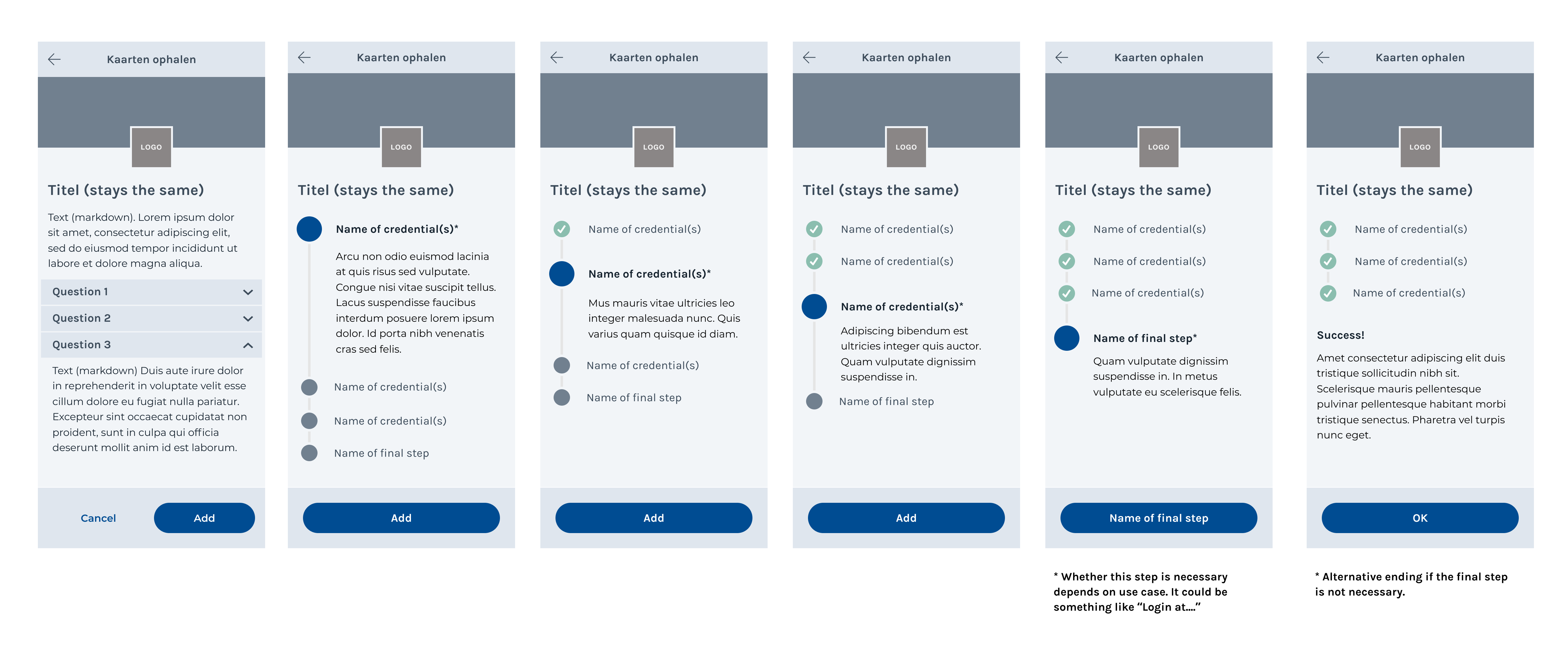
In the IRMA wizard, users are presented with an overview of all the credentials they have to obtain to use the service and they are invited to obtain the first card. After each successfully obtained credential, users automatically return to this overview page, receiving feedback that the step has been completed. The wizard invites users to move on to the next step and thus obtain the next IRMA card. There is only one path to follow, and as long as users ‘go with the flow’, they will automatically end up with the right set of IRMA cards to use their intended service. At the very end, the wizard makes sure the users can continue with what they want to do. If users, e.g., download all the cards they need to use a health platform, they will be guided to log into this health platform as the final step of the flow. This ensures that users can directly do what they actually want to do after completing the wizard: use a certain site or service.
The mockup
The IRMA made easy project, together with Ivido, SIDN and the Privacy by Design Foundation has created a mockup of this feature. You can see an abstract representation with dummy text below:

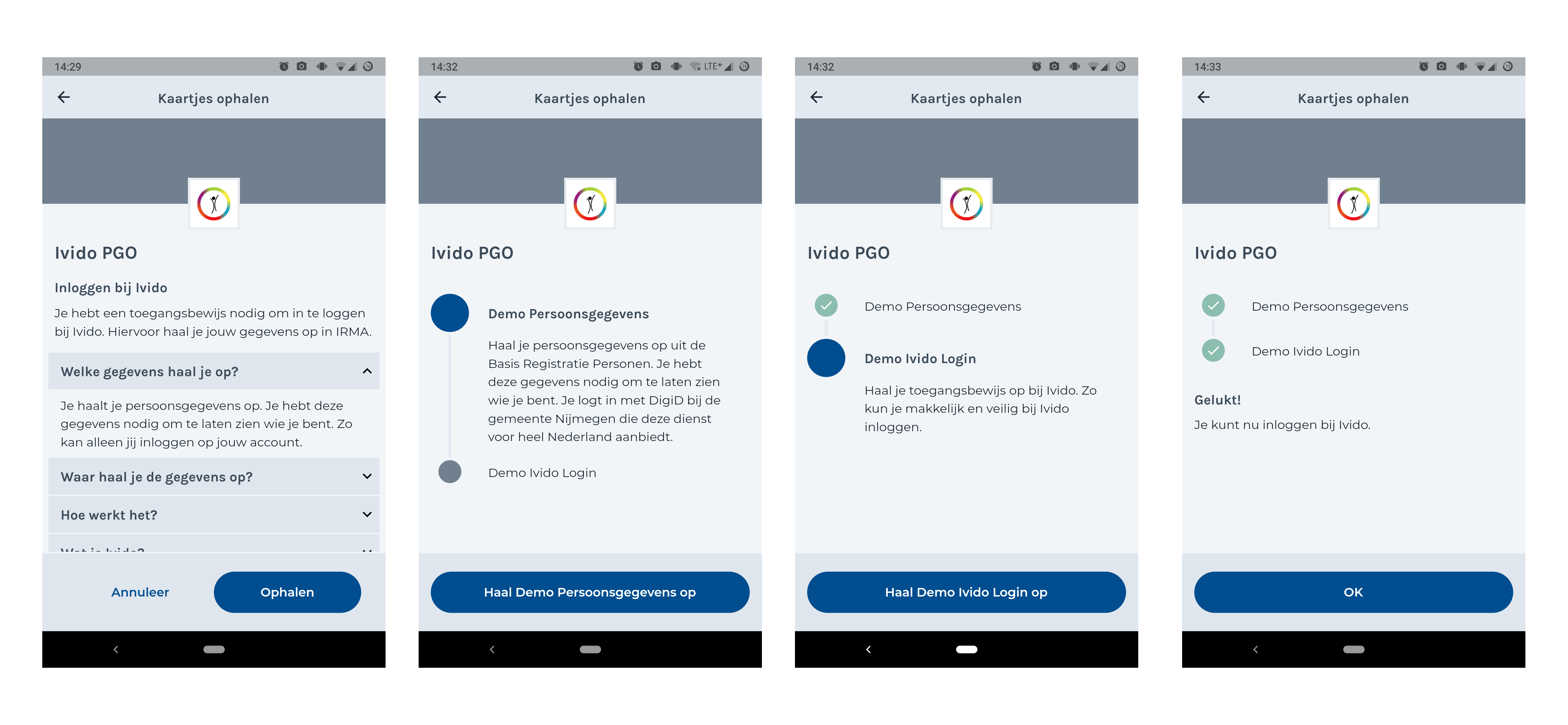
The design concept was then taken up by the development IRMA team at SIDN and has been released for testing in the current beta version of the IRMA app (from 25th of March 2021). You can see a screenshot of how this wizard could look in the IRMA app below.

In contrast to the mockup, this screenshot shows a concrete use case, based on Ivido’s needs. The plan, of course, is to provide this as a general feature.
Limitations of the current implementation
As the mockup shows, the initial version of the wizard will not support users to choose what cards to load. This might come as a surprise because some services allow users to choose what they want to use. The IRMA-meet service, for instance, allows users to choose between their LinkedIn name and their name from the Dutch Personal Records Database (BRP).1 We have decided that choosing which piece of information to obtain is not part of the intended flow. However, we believe the wizard should be designed in a way that such an option can still be added later on.
For now, the wizard focuses on users completing the wizard on a mobile phone. Of course, users subsequently still can use IRMA on a website that they have open on a desktop computer or laptop. However, during the wizard-flow, users are kept on their phone as much as possible. This is because the IRMA app has much more control over the flow this way.
Conclusions and future work
The IRMA made easy project aims to make IRMA easier to use. One of the most pressing usability issues is the complexity of the first-use journey. This process is particularly difficult if users need to load several cards into IRMA before they can use a certain site or service. The IRMA made easy team has addressed this issue with project partners and proposed a wizard feature that guides users through this process. A minimum viable product of this idea has been implemented and is available for testing in the beta version of the IRMA app. Feedback from the community about this feature is welcome.
For the future, we suggest helping users even more from within IRMA. For instance, a quick start option for common use cases could be included in IRMA as well (see screenshot).

We believe such a list can help users recognize their underlying goal in the IRMA app. Testing the wizard and the quick start feature with actual users should reveal wether these ideas are indeed welcome additions.
-
This concept of accepting different credentials is also quite common in the real world, where often, people can choose to show a passport, ID card or driver license. ↩︎